Cascading Elements
3 minutes to readCascading elements can help your end user quickly refine their input while filling out fields in submission and search forms. Caspio provides a variety of cascading elements that automatically populate with options based on the previous selection.
For example, if the first field asks an end user for their State, the County field can dynamically offer only the counties located in the selected State, and so on for the City field.
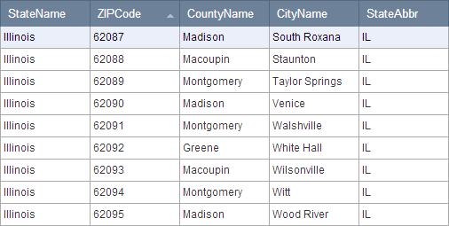
When configuring cascading elements, you will need to refer to a lookup table that contains fields that represent a relationship between parent and child values. For instance, a State field can serve as the parent value for several corresponding child values such as County, City, and ZIP Code.
Cascading Text Fields
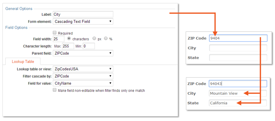
Cascading Text Fields improve data entry by automatically filling in any matching child values based on the parent value. This is especially helpful when the child values are unique to the parent entry. For example, if the first field asks an end user for their ZIP code, the appropriate City and State fields will automatically populate.
The image below shows how a Cascading Text Field is configured in this scenario:
Note: If the child field is set to a Cascading Text field, but multiple values match the entry in parent field, then the text field will remain blank for the user to manually complete their entry. Use Cascading Dropdowns, Listboxes or Radio Buttons in these cases so that all matching values can be presented to the end user.
Cascading Radio Buttons, Listboxes and Dropdowns
Cascading Dropdowns, Listboxes and Radio Buttons can be used when there are multiple values for the user to select for the child fields.
Cascading Dropdowns
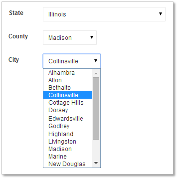
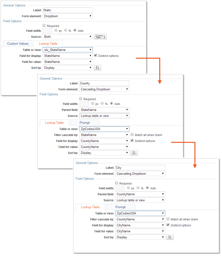
The image below shows how a Cascading Dropdown is configured for a typical scenario with State, County and City fields.
Cascading Listboxes
Cascading Listboxes are configured the same way as Cascading Dropdowns, and the image below shows the same scenario with listbox fields.
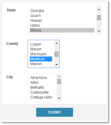
Note: The Listbox multi-select option can only be enabled in search forms (not submission forms).
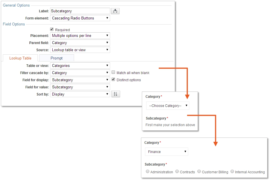
Cascading Radio Buttons
Cascading Radio Buttons are a user-friendly way to display multiple child options to the end user based on their previous selection in the parent field.
For example, if the parent is a dropdown where the end user selects a Category, a Subcategory group of Radio Buttons can automatically appear.
There is a checkbox Match all when blank. Check this option if you want to display all child options even if the parent selection is blank. Common practice is to uncheck this option.
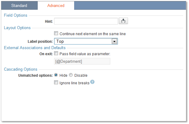
There are two more display choices in the Advanced tab under Cascading options. Default choice is Hide where the unmatched options will be hidden upon parent selection, versus Disable where the unmatched options will display as disabled. Common practice is to choose Hide.
The image below shows how Cascading Radio Buttons are configured in this scenario and where Hide option is selected:
Note: If you have a significant number of child options, consider using Cascading Dropdowns and Listboxes. Cascading Radio Buttons are limited to 100 options per field.
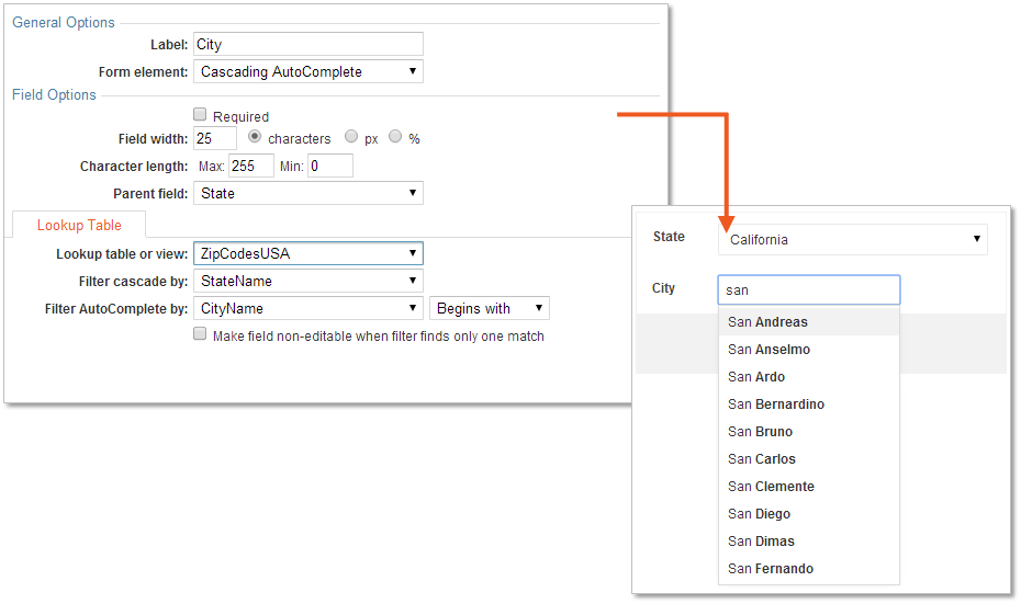
Cascading AutoComplete
Cascading AutoComplete fields function just like regular Auto-Complete fields, but only suggest options related to the parent field. When a child field is set to Cascading Auto-Complete, the scope of the filtering is limited to values that match the parent value.
For example, if the parent is State, the Cascading AutoComplete field will suggest the cities within the selected state once the user starts typing.
The image below shows how Cascading AutoComplete is configured in this scenario.