Tabular Report
9 minutes to readA Tabular Report organizes a set of fields into columns much like a spreadsheet, with each data source record listed in a row. It may be especially helpful for creating dashboards to present data in a spreadsheet-like format. For instance, in your sales department, you can present the sales transactions by a customer, an item type, or cost.
Note: On mobile devices, Tabular Reports are displayed as Card Reports for better user experience and clearer data presentation. The mobile view shows all the custom actions that you configure for a Tabular Report but it does not reflect any data grouping.
Steps to create Tabular Reports
- Select the fields you want to include in the report:
- In the upper panel, select the Add elements button.
- Select Reports → Tabular.
- In the Data source panel, select a table or view that will be the primary data source for your DataPart.
- From the Available fields panel, select the fields you want to use in your app. To do that, click the field or drag and drop it into the Selected fields section. You can bulk-add all the fields by clicking the Select all button.
- Optional: If you want to group the records in a Tabular Report by one of the data source fields (for example, customers by their country), drop a field you want to group the records by into Field used to group data (optional).
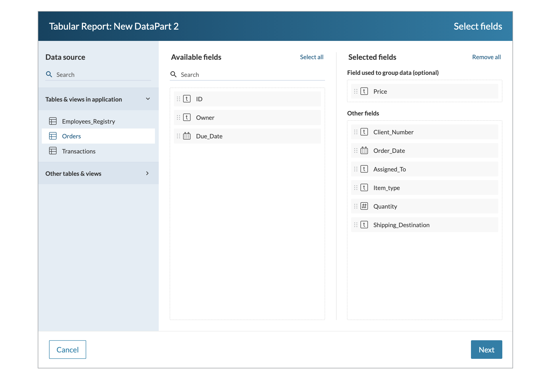
Note:
- For each Attachment field in the source table, two options are available: File name, which can be shown as text or download link, and Preview. You can select either of them, or both.
- For record grouping, the following fields are available: Text (255), Number, Integer, Currency, Date/Time, Yes/No, and Formula.
-
- Click Next.
- In the Elements panel, arrange the report fields:
- If a Date/time field is used for data grouping, select that field. Then, on the General tab, in the Data grouping dropdown list, select a type of grouping.
For example, you can group report data by the day of the month to analyze daily sales trends, identify peak selling days, and track revenue performance over time. - Optional: If you want to add customizable HTML content for descriptive text, links, or graphics to the AppPage, click Add > HTML block and edit the code.
You can format the content in the visual editor or enter your custom code. HTML blocks support inserting parameters. - Optional: Manage the display of fields in the report. You can rearrange the order of fields using drag-and-drop or remove fields.
- If a Date/time field is used for data grouping, select that field. Then, on the General tab, in the Data grouping dropdown list, select a type of grouping.
- Configure the report fields:
- In the General tab, provide a label for a field column.
- Optional: In the Hint field, add a text that should be displayed in a tooltip.
- In the Appearance tab, select the field size (column width) and alignment (left, center, or right). For the field size, you can select:
- Auto – defines the width of a column by the size of the content inside a field.
- Fixed – allows for setting the precise size of the column field width in pixels [1-9999px]. The content of a field will not be visible if it exceeds the set size.
- Optional: If you want to edit the formatting and style for this field, in the Format and style section, click Format. In the panel that opens, select the value type and its formatting options, such as regional formatting or decimal places, if applicable.
- Click Save.
After creating a Tabular Report, you can modify it by applying additional configurations. Learn more.
Note: You can restrict the visibility of specific records in a report by managing Roles permissions. Learn more.
Configuring additional options for a Tabular Report
After creating a Tabular Report, in the right panel, you can configure additional options of a DataPart. The following configurations are available:
DataPart configuration
- Change data source and fields — select this button to edit the data source and its fields. This option may be helpful when you want to add or remove fields from a data source or change a data source to a different table or view.
- Heading — the heading shown above the report
- Description — the text shown below the heading
- Size — the height of the Tabular report on the AppPage
Data filters
Select Data filters to set up criteria for DataPart filtering. Learn more.
Interactive controls
In this section, you can enable additional actions for app users. Depending on the place on your DataPart where you want the controls to appear, you can add the following types of interactive controls:
- Header controls are buttons that app users select to go to an AppPage or a URL, or to download the report results. They appear in the title area of the DataPart.
- Toolbar controls are buttons for actions such as going to another AppPage or a URL, downloading the results or deleting selected records. They appear at the top of the DataPart, below the header if it exists.
- Record controls are buttons for actions on a single record, such as opening a Details/Update Form or deleting the record. They appear next to the record when an app user hovers over it.
Add a control
- Select Add to configure a new control.
- In the panel that opens, under Type, select one of the following:
- Action adds a button that does one thing when an app user selects it. Enter an Action name, and then choose an action in the Action dropdown:
- Open AppPage navigates to another AppPage. Use it to link to a Submission Form to create a new record or a Details/Update Form for viewing or editing a record.
- Go to URL navigates to an external URL.
- Download exports the report results to an XLSX file. It is available in Header controls and Toolbar controls only. See Add a Download action.
- Dropdown adds a dropdown menu button that groups several actions under one button. See Group actions.
- Action adds a button that does one thing when an app user selects it. Enter an Action name, and then choose an action in the Action dropdown:
- Enter a Label for the control, and then select Save.
Notes: Record controls only support the Open AppPage and Go to URL actions. When either redirection option is used, session parameters are automatically passed between the DataPart and the destination page. For Open AppPage, you can configure an alternative option to pass query string parameters instead. To learn more, see Communication Between DataParts.
Turn on the Delete control
A Delete control is included by default in both Toolbar controls and Record controls. Toggle it on to enable it.
- As a toolbar control, the Delete button removes selected records from the data source.
- As a record control, the Delete button removes the specific record from the data source.
For each of these, you can choose to display a confirmation message in a dialog window or allow users to delete records without a confirmation.
Add a Download action
A Download action lets app users export the report results to an XLSX file.
- Select Add in Header controls or Toolbar controls, keep Type set to Action.
- Enter an Action name, and select Download in the Action dropdown. Then configure the following:
- File type is XLSX. It is the only available file type, so the field is disabled.
- File name is the name of the downloaded file. To add a changing value, select the parameter icon to insert an app parameter or a system parameter, such as the file creation timestamp.
- Compress as a .zip file downloads the file as a .zip file.
- Number of records sets which records the file includes:
- All matching includes the records that match the report’s current filters. This is the default.
- Entire data source includes all records from the data source, regardless of the report’s filters.
- Other includes the exact number of records, taken from records that match the report’s current filters.
- Enter a Label for the control, and then select Save.
What the downloaded file contains
- Only the fields visible on the report, in all supported field data types.
- Only the records the app user can access based on their Role permissions.
- For attachment fields, the file name with its extension in the cell (for example, Invoice.pdf), whether the report displays the field as File name or Preview.
Group actions in a dropdown menu button
A dropdown menu button groups several actions under one button, which keeps the controls on your report compact. App users select the button to see the list of actions.
- Select Add in Header controls or Toolbar controls.
- Set Type to Dropdown.
- Enter a Dropdown name and a Label.
- Select Save.
The dropdown appears in the list of header controls with a Drop controls here area under it. Drag controls from the list into that area to place them in the dropdown.
Display
Use the Display section to configure the number of records: in total and per page, as well as manage additional controls.
Pagination
Enable the Maximum total records toggle to limit the number of displayed records to the value you set in the input field.
The Records per page option allows you to specify the number of records displayed on each page. You can display between 1 and 1000 records per page. You can also give the app users control over this by enabling the Allow user to select records per page toggle.
Under Additional controls, you can:
- Enable displaying a column showing row numbers,
- Decide if the total number of records on the page should be displayed.
Sorting options
If you want to sort data by default, in the Default sorting section, select one of the options:
- To sort the report based on field values, select By field, and then add and arrange the sorting fields.
- To sort the report in an arbitrary manner, select Random.
If you want to allow app users to sort the report based on field values, in the Sorting options for app users section, select the options as required:
- To make column headers clickable, allowing users to sort by the field values in a specific column, turn on the Sort by column headers toggle.
- To display a dropdown with a list of fields available for sorting, turn on the Sort via dropdown toggle.
By default, the dropdown lists all the fields included in the report and the Default sorting option. You can customize the dropdown list by adding, removing, and rearranging the options. Also, you can click a field to edit its label in the dropdown.
