Charts
9 minutes to readCharts are an effective way of visually communicating data. It helps users draw insights and see patterns that otherwise may be easy to miss.
You can add charts to your Caspio applications as standalone DataPages or as part of report DataPages.
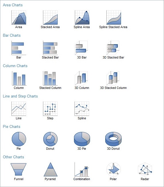
Caspio offers the following chart types:
| Area Chart | Stacked Area Chart | Spline Area Chart |
| Spline Stacked Area Chart | Bar Chart | Stacked Bar Chart |
| 3D Bar Chart | 3D Stacked Bar Chart | Column Chart |
| Stacked Column Chart | 3d Column Chart | 3D Stacked Column Chart |
| Line Chart | Step Chart | Spline Chart |
| Pie Chart | Donut Chart | 3D Pie Chart |
| 3D Donut Chart | Funnel Chart | Pyramid Chart |
| Combination Chart | Polar Chart | Radar Chart |
Creating a Chart DataPage
Creating a chart DataPage begins like a Report DataPage where you specify the data source and configure other aspects of the DataPage. These details can be found in the Report DataPage article and are not repeated here.
On the first screen of the DataPage wizard you will select Charts from the list of DataPage types and select your chart type from the area on the right. You can scroll down this area to see more chart types to choose from. Some of the specific chart configuration options that will be presented to you on the next screens of the wizard will depend on the chart type that you have selected.
Once you advance a few steps through the wizard you will reach the chart configuration screens. These screens are discussed below.
Configure Chart Options screen is the primary area where you define the data and behavior of your chart.
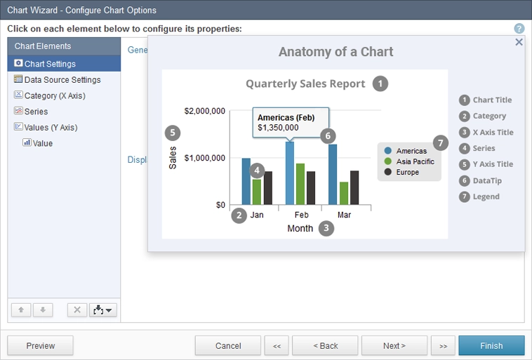
As you go through this article you can use the image below as a guide to the terminology used in Caspio charts. Note that the anatomy of a chart may vary depending on its type.
You must select each Chart Element on the Chart Elements panel, from top to bottom, and configure its settings on the right. Note that some of your selections will change the remaining Chart Elements.
Charts Settings
On this screen, you can specify the basic settings of your chart.
- Title and Subtitle fields are optional. They allow you to give your chart a descriptive title. In addition, you can use the Picker tool to insert System Parameters.
- Chart Width and Height are set to “Auto” by default which means that the chart will fit the width of the browser (or table, frame, div of the page) and the height will be 400px. “Auto” also means that the chart width is dynamically adjusted as the screen is made smaller or bigger. Alternatively, you can provide a fixed value for the chart width and/or height.
- Enable zooming option provides capability to zoom-in on parts of the charts. It can be helpful when there are a lot of data points plotted on the chart.
- Enable chart actions menu adds a small dropdown menu to the chart with options to download or print the chart. Note that this option only applies to the chart and not the entire DataPage or page.
- Display legend turns chart legend on or off.
- Legend title can be used to specify a heading for the chart legend.
- Enable Display vertical/horizontal gridlines to the chart area to enhance its readability.
Data Source Settings
The options on this screen depend on how your data is stored. This choice will affect some of the remaining chart elements and how they can be configured. The choices are:
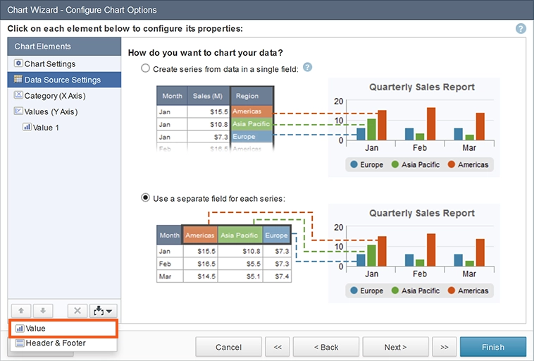
- Create series from data in a single field – this option must be used if all your series are values in one field, as shown in the example. These charts are also called pivot charts and dynamic series charts. This option allows for one value field.
- Use a separate field for each series – this option is appropriate when each of your series is in a separate field. With this option, you can have up to 20 series (values). They can be inserted using the picker icon at the bottom of the Chart Elements panel.
Category (X Axis)
The Category field is usually on the X or horizontal axis and contains the name or label of your data points. These are your identifiers for the values. For example, if comparing sales values by year across regions, year and regions may be series or category fields, depending on how you want to group your data points. If a date field is selected as a category, you can choose to group the date by whole field or date rollup. If you have large number or records, it is preferred to choose Date rollup grouping and to group by Year or Month.
Pie charts have no Axes. The name of each slice is essentially the category.
- Axis title is the name of your category.
- Category field is the field from your table that will contain categories.
- Label direction specifies how the category labels are displayed. By choosing Auto-rotate, when necessary, labels are shown at an angle.
- Label length setting specifies the maximum number of characters for category labels. Longer labels are truncated.
- Formatting is used to customize how numeric, date and yes/no values are displayed in category and sub-category values. Options depend on the data type and localization.
Series
If the Series element is available for your chart type, you must select how the different data points of your chart are grouped. For example, if charting sales numbers by region per sales person, perhaps the series field is the field containing the name of the sales people.
The Formatting option allows you to customize how the values are displayed.
Pie, Funnel and Donut charts do not have series fields.
When a date/time field is selected, an additional rollup option allows values to be grouped by hour, date, weekday, month or year.
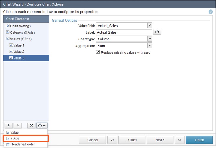
Values (Y Axis)
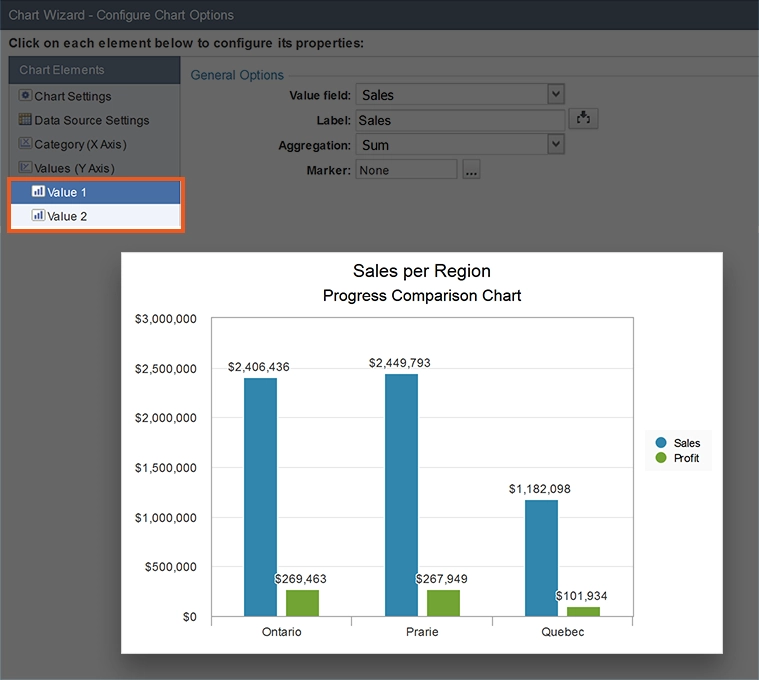
Value fields are numeric fields that are used to plot your chart. For example, if charting sales by sales person, the value field is the sales amount. If Use a separate field for each value option was selected in Data Source Settings, you can add multiple values using the picker at the bottom of the Chart Elements panel. An example of an additional value would be profit by sales person.
- Axis title is the title for your Y axis.
- Axis value range specifies the smallest and the largest values on the Y axis. The default is “Auto”.
- Logarithmic scale is a nonlinear scale used when there is a large range of quantities. Not available when more than one Y Axis is present.
- Axis position provides ability to position the Y Axis to the right or to the left of the chart.
- Label direction specifies how the value labels are displayed. By choosing Auto-rotate, labels are automatically shown at an angle when space is limited.
- Value Label specifies if values should be placed on the chart for each point (“Label” option). “DataTip” option lets the user mouse over the data point to see the value. You can customize the content of the DataTip with most HTML options available to you.
- Formatting lets you set axis values to currency, percentage, number in your preferred currency or localization setting.
Each Value field can be further configured using the following options. Note that only one Value is available for some chart types and settings, as discussed above.
- Value field is the field that should be plotted on the chart.
- Label is available when series are driven by individual fields.
- Chart type becomes available for each value when Combination chart is selected. It is used to specify how each value should be shown.
- Aggregation option lets you specify how the values should be handled. Choices depend on the data type of the value field.
- Replace missing values with zero plots missing data points as zero values when enabled. Not available when logarithmic scale option is enabled for the axis.
In Combination charts, you can choose to add multiple Y Axis and each Y Axis can have its own one or more value fields. To add a new Y Axis, use the picker at the bottom of the Chart Elements bar.
Once you’ve configured the chart, click Next to continue to Chart Page Options screen. On this screen you can specify the following options:
Chart sort order – The fields that are available for sorting your chart values are displayed. You can select up to four levels of sorting and each can be ascending or descending. Note that Category (X Axis) is the default selection.
Consider the following recommendations for sorting your chart values:
- Line, Step and Spline charts are frequently ordered by date/time field such as timestamp because these charts usually show changes over time.
- Bar and Column charts are frequently ordered by the category field so that bar/column groupings are alphabetically arranged.
- Pie charts are frequently ordered by the value field so that pie slices are arranged largest to smallest in a counter clockwise direction around the pie.
Maximum data points on chart – This value specifies how many data points can be plotted on your chart. In a bar chart for example, this refers to the number of bars. You should keep usability in mind when selecting this value. The maximum is 1000.
Click Finish.
Note that throughout your configuration process you could click on Preview to see your chart as it is taking shape. Preview opens a new browser tab to show your work in progress. It does not save your work.
Customizing Charts
You can further customize the look and feel of your chart in Styles section of Caspio. Mouse over your Chart DataPage and expand Properties. Open this style and edit the Results Page/Charts section. Learn more about creating or modifying styles.
Chart color scheme is based on the selected color pallet in the Style object. A predefined or a custom color scheme can be selected.
Additional Facts about Charts
- In deployed charts, your app user can hide or show each series interactively by clicking on the series name in the legend.
- Charts support up to 50 series.
- Charts are available as standalone Chart DataPages or as part of Combined Chart and Report DataPages.
- Caspio charts are Section 508 compliant for visually impaired users.