Form Element Types
5 minutes to readForm elements allow you to customize how fields appear on your DataPages. Your fields can be configured to become a checkbox, dropdown, a regular text field, or other form element types.
Caspio offers a variety of form element types described below in this article.
Standard Elements
Special Elements
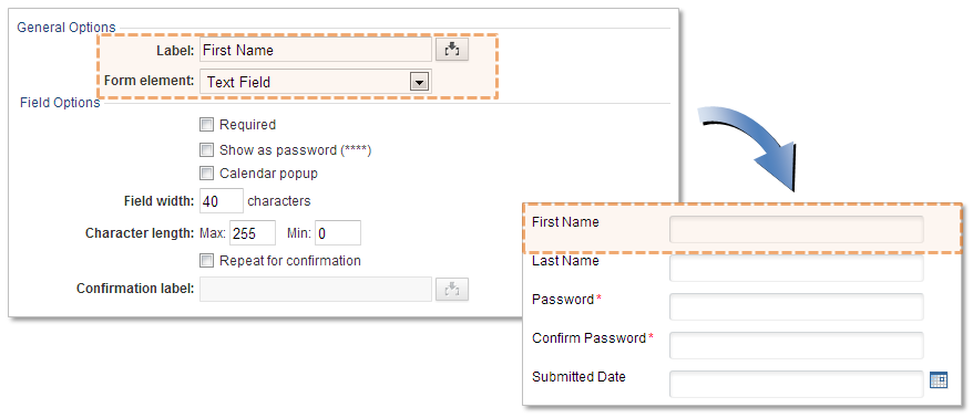
Text Field
A text field displays a single line for text entry. You can make this a required field, adjust the field width, and set the maximum number of characters that can be entered. The maximum value must not be greater than 255.
You can also customize the field to show as password encrypted characters (****) or include a calendar popup. For password text fields, you can also add a second password field entry for confirmation.
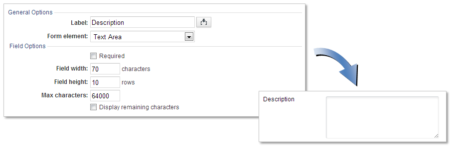
Text Area
A text area displays a box for text entry. You can make this a required field, adjust the field width and height, set the maximum number of characters that can be entered, and display number of remaining characters as user types in. The maximum number of characters must not be greater than 64000. This type is typically used for long descriptions or comments.
You can also enable rich text editing toolbar from the Advanced tab and select the toolbar type Simple, Standard or Advanced.
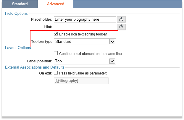
Note that when you enable the rich editor, the HTML codes will be stored in the table along with the text. Therefore its more likely to reach the 64000 character limit than when using the regular text area. You may want to enable this feature for your app user only when necessary.
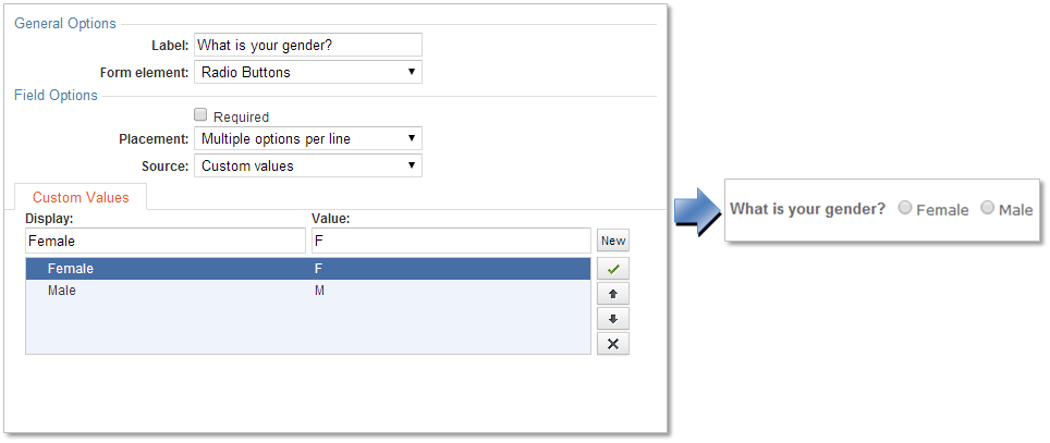
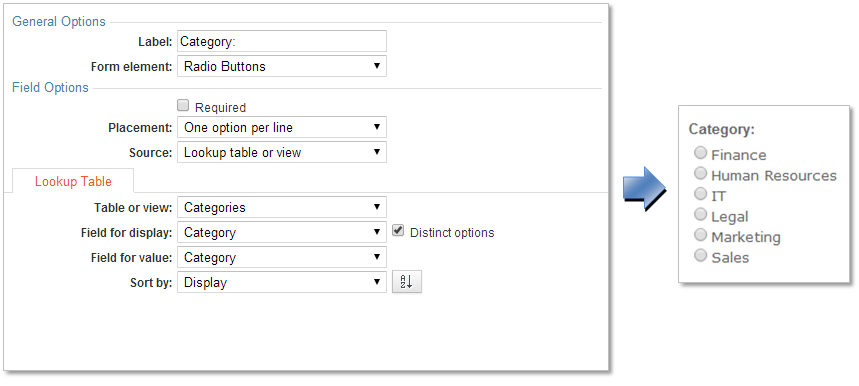
Radio Buttons
Radio buttons display a set of options where the user is only allowed to choose one option. Each option is displayed with a round button to the left. You can choose to place your radio button options on a single line or one option per line.
Similar to dropdowns and listboxes, you can configure radio buttons with a Source based on Custom values, Lookup table or view, or Both.
If you use custom values as the source, you can enter custom values in the Display and Value fields using the DataPage Wizard. After entering each value, click New to add another option and use the X button to remove an option. You can re-order options using the up and down arrows. To make a particular radio button selected by default, click on the option and click the checkmark button.
If you use a lookup table or view as the source, you can choose specific fields to use as the display and value for each radio button. Enable distinct options to prevent duplicates in the list and optionally sort by the display or value field.
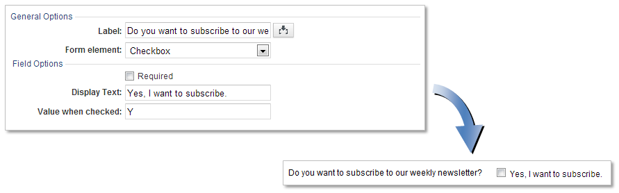
Checkbox
A checkbox displays the field as an option where the user can choose to select it or not. This field is displayed with a square box. You can make this a required field, add a display text, and set a value when checked.
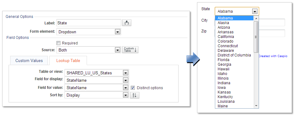
Dropdown
A dropdown displays options in a list where the user is only allowed to choose one value. You can add custom values, use a lookup table or view, or both as the source for your values.
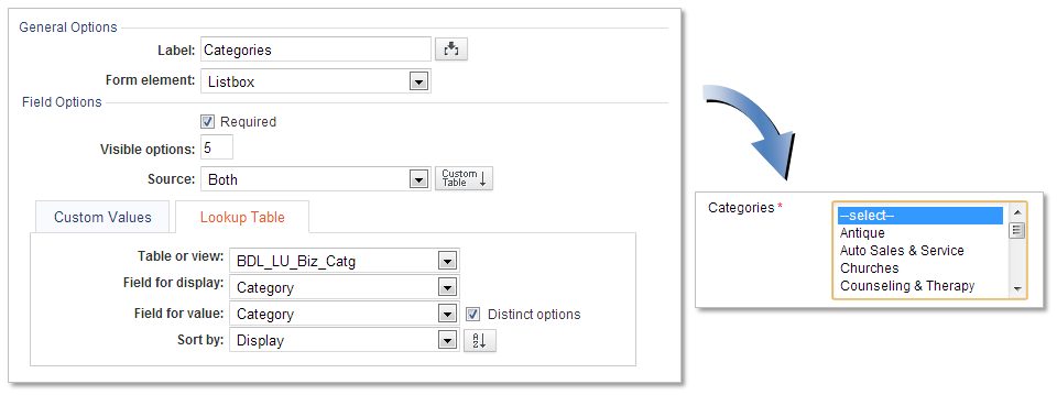
Listbox
A listbox displays options in a list where the user is allowed to select one or more items from the list. You can add custom values, use a lookup table or view, or both as the source for your values.
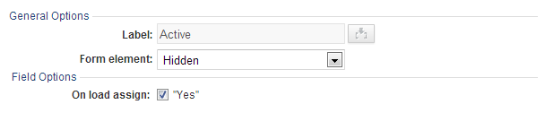
Hidden
The Hidden form element allows you to hide the field, so it will not appear on the DataPage at all. You can assign a value on load.
Display Only
The Display Only form element displays a field with an existing value. Users cannot change the value. You can format the field with your own localization settings.
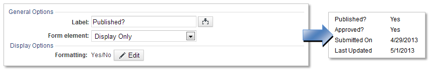
For a details page, all DataPage elements will have the Form Element to Display Only by default.
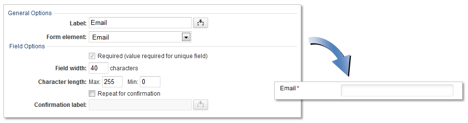
An email form element prompts users to enter an email address in the text field. The value entered must be in an email format or an error will display. You can make this a required field, adjust the field width, and set the maximum number of characters that can be entered. You can also add a second confirmation field to confirm the email address.
AutoValues
An AutoValue form element automatically populates the field with a value. The value can be a random unique ID for human use, a random password, user IP address, or DataPage Host.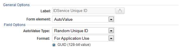
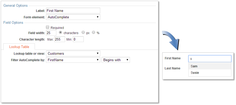
AutoComplete
An AutoComplete form element is like a regular text field, but a suggestion box will appear as the user types keywords whenever there are matching options already in the database. You need to select a lookup table or view as the source for filtering values based on either “Begins with” or “Contains” comparison types.
Learn how to configure AutoComplete elements.
Cascading Elements
Caspio provides a variety of cascading form elements to automatically filter child fields based on the previously-selected parent field. For example, the parent could be a State dropdown and the child would be a cascading County dropdown followed by City.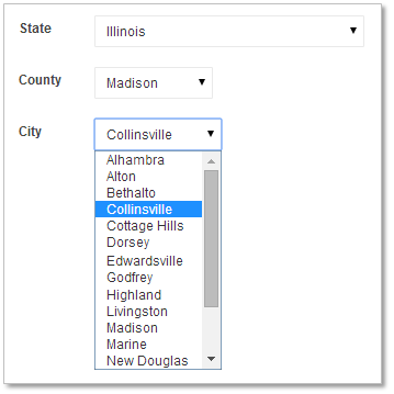
Types of Cascading Elements:
- Text Fields
- Dropdowns
- Listboxes
- Radio Buttons
- AutoComplete
Learn how to configure Cascading Elements.
Calculated Values
A Calculated Value form element dynamically generates a value when users interact with other fields used in the calculated value’s formula.
Learn how to configure Calculated Values.