Looking for options to customize your charts? In this article, we will guide you on how to add an additional chart, configure the chart type or style your charts.

  1. Steps to add an additional chart:

    In this example, we will show how to add  line chart for the total value of each category in the column chart DataPage.

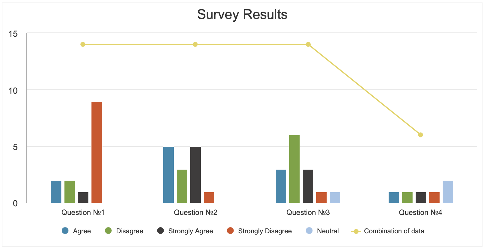
    • Edit your column chart DataPage.
    • Add Header & Footer in the Chart Wizard – Configure Chart Options screen.
    • Disable the HTML Editor in the Footer.
    • Copy and paste the following code in the Footer section of the DataPage.
  2. Steps to change the chart type:

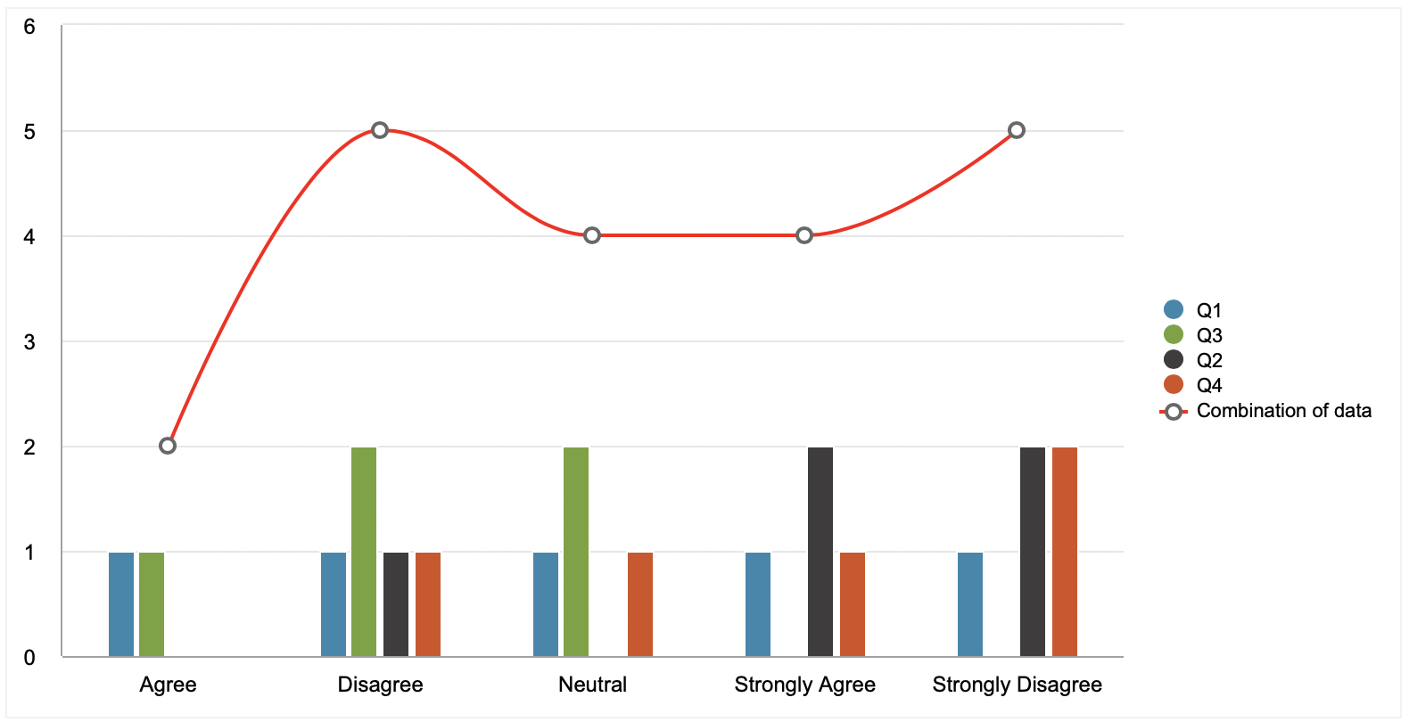
    You can change the chart type by modifying the following part of the code mentioned above.

    • For a spline chart, replace the part of the code above with the code shown below:


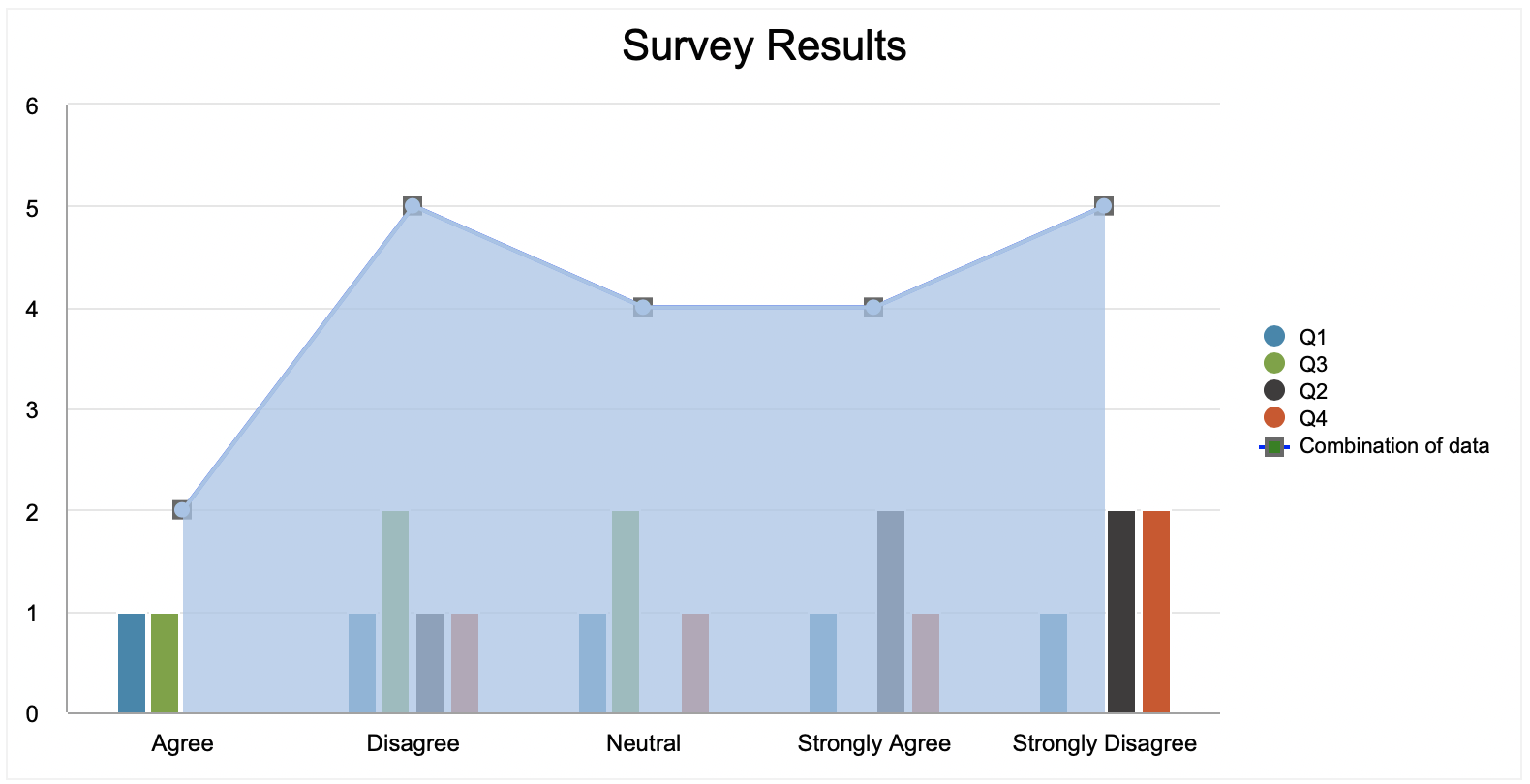
    • For an area chart, replace the part of the code above with the code below:


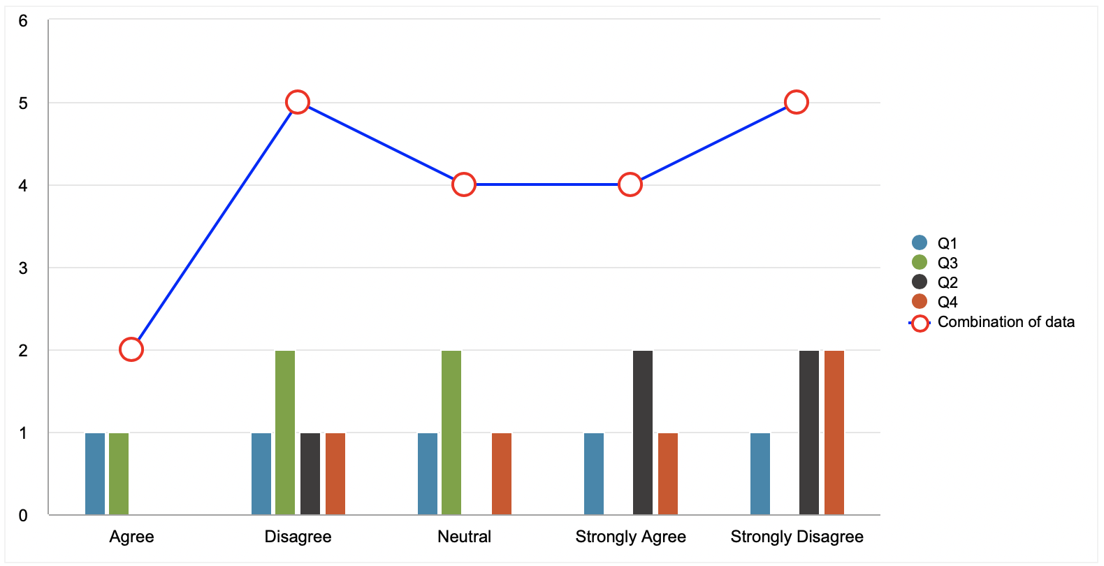
  3. Steps to configure attributes of a chart:

    You can configure color, size and shapes of a chart by adding additional attributes in the code.


For more specialized charts like Gantt, Bubble charts, etc., you may reach out to our Professional Services Team. More details can be found in the App Extensions Gallery.

Note: This article uses external HTML, JavaScript, or third-party solutions to add functionality outside of Caspio Bridge’s standard feature set. These solutions are provided “as is” without warranty, support or guarantee. The code within this article is provided as a sample to assist you in the customization of your web applications. You may need a basic understanding of HTML and JavaScript to implement successfully.

For assistance with further customization based on your specific application requirements, please contact our Professional Services team.

code2
Highcharts.charts[0].addSeries
                    ({    
                            name: 'Combination of data',
                            type: 'spline',
                            data: getToAddToChart,
                            plotOptions: {
                                series: {
                                    dataLabels: {
                                        enabled: true,
                                    }
                                }
                                 },
                        }, true);
code1
<script>
        document.addEventListener('DataPageReady', function()
        {
            var cleaner = function(interv) {
            clearInterval(interv);
            } 

            let interv = setInterval(() => {

                if(typeof Highcharts == "undefined" || !Highcharts.charts.length) return;
                
                    var seriesLength = Highcharts.charts[0].series.length;
                    var getInsideValue = Highcharts.charts[0].series[0].userOptions.data.length;

                    cleaner(interv);
                    
                    var getCoordinateSpline = [];
                    var getIndex = 0;
                    var getToAddToChart = [];
                    
                    for(var i=0; i < seriesLength; i++)
                    {
                        getCoordinateSpline.push(Highcharts.charts[0].series[i].userOptions.data);
                    }

                    console.log(getCoordinateSpline);

                    for(var j=0; j < getInsideValue; j++)
                    {
                        var addVal = 0;

                        for(var k=0; k < getCoordinateSpline.length; k++)
                        {
                            addVal += getCoordinateSpline[k][j].y;
                        }

                        getToAddToChart.push(addVal);

                        addVal = 0;
                    }

                    console.log(getToAddToChart)
                    
                    Highcharts.charts[0].addSeries
                    ({    
                            name: 'Combination of data',
                            type: 'line',
                            data: getToAddToChart,
                            plotOptions: {
                                series: {
                                    dataLabels: {
                                        enabled: true,
                                    }
                                }
                                 },
                        }, true);
        }, 100);
        });
</script>

code3
Highcharts.charts[0].addSeries
({    
                            name: 'Area Chart',
                            type: 'area', 
                            data: getToAddToChart,
                            center: [100, 80],
                            size: 100,
                            showInLegend: false,
                            plotOptions: {
                                series: {
                                    dataLabels: {
                                        enabled: false,
                                    }                        
                                }                         
                                 },
                        }, true);
code4
Highcharts.charts[0].addSeries
                       ({    
                            name: 'Pie Chart',
                            data: getToAddToChart,
                            color: '#FF0000',
                            type: 'pie',
                            center: [100, 80],
                             size: 100,
                            plotOptions: {
                                series: {
                                    dataLabels: {
                                        enabled: true,
                                    }                        
                                }                         
                                 },
                        }, true);
code5
Highcharts.charts[0].addSeries
                    ({    
                            name: 'Combination of data',
                            data: getToAddToChart,
                            color: '#0000ff',
                            marker: { 
                                    fillColor: 'white', 
                                    lineWidth: 2, 
                                    lineColor: '#ff0000',
                                    radius: 8,
                             },
                            type: 'line',
                            plotOptions: {
                                series: {
                                    dataLabels: {
                                        enabled: true,
                                    }                        
                                }                         
                                 },
                        }, true);
code6
                    Highcharts.charts[0].addSeries
                    ({    
                            name: 'Combination of data',
                            type: 'line',
                            data: getToAddToChart,
                            plotOptions: {
                                series: {
                                    dataLabels: {
                                        enabled: true,
                                    }
                                }
                                 },
                        }, true);