Calendars
10 minutes to readCalendar DataPages enable you to display your table data in monthly or weekly calendar layouts. They are multi-page applications that provide the following high-level capabilities:
- An interactive search form or pre-defined criteria
- A results screen where matching records are displayed in a calendar format
- An optional details page where one record is displayed and some or all fields may be editable
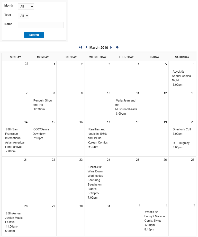
Example: Monthly Calendar DataPage
Creating a Calendar with Interactive Search
Calendars are created easily through DataPage Wizards. In the section, you create a Calendar DataPage with an interactive search form, a results page, and a details page. These instructions show you how to create a sample seminar calendar with a search form and details page.
Ensure that your data source must have a date/time or timestamp field and it must be available prior to the creation of the Calendar Datapage. In this scenario, records of seminar events are listed into a table. The table name is Spring_2013_Seminars. The table design is displayed:

Detailed steps to create a Calendar Datapage:
- On Caspio homepage, click DataPages on the sidebar menu and click New DataPage.
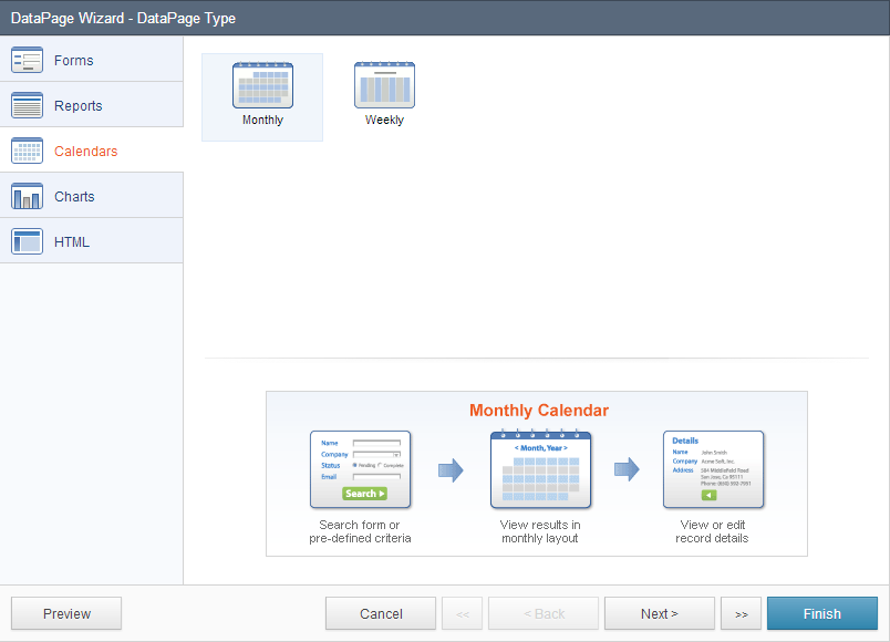
- On the DataPage Type screen, select Calendars on the left menu and click Monthly.
- On the DataPage DataSource screen, you can select the table or view as your data source, Style and Localization. Select whether your DataPage will be publicly accessible or restricted by an Authentication or Connection.
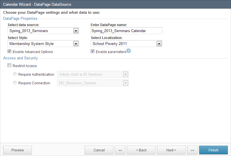
In this scenario, Spring_2013_Seminars is the table used as the data source for this DataPage and the DataPage is named “Spring_2013_Seminars Calendar”. No authentication is required. - On the Search Type screen, you can customize how the search will be performed. You can allow users to use a search form to select and filter the Results page or automatically display results based on a pre-defined criteria. If you decide to allow users to select data using a search form, check Show Search Form. You can also check Place cursor in first field, which allows the first field to be automatically selected.
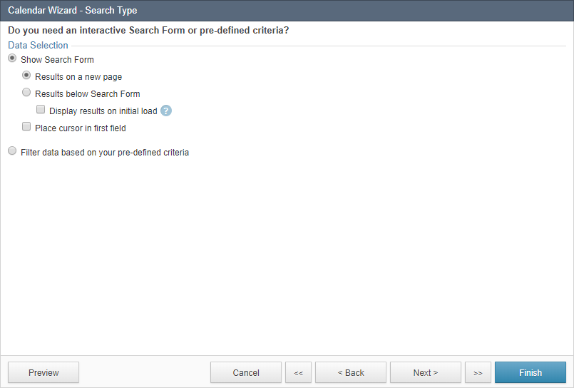 Alternatively, if you decide to filter data based on your pre-defined criteria, check Filter data based on your pre-defined criteria, which automatically directs your users to the results page based on set criteria and do not provide users with a search function. If this DataPage is protected by an Authentication or Connection, you can also enable Record Level Security, which correctly identifies and associates each user from the Authentication or Connection data source to the user’s record in the current data source.
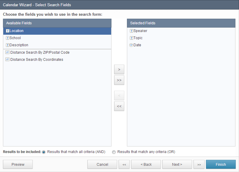
 - On the Select Search Fields screen you can select which fields are used in your search form. To select fields, move the fields from the Available Fields list to the Selected Fields list. You can also choose to include how the criteria should filter your results. Check Results that match all criteria (AND) to return records where all selected criteria are true. For most scenarios, the Boolean operator must remain at this default state. Check Results that match any criteria (OR) to return records that match any of the selected criteria.
- On the Configure Search Fields screen you can configure the functionality, appearance, data validations, and other properties for your search fields. Select a field from the DataPage Elements menu on the left and configure field properties on the right. You can insert new elements into your search form, including a New Criteria, New Section, HTML Block, Virtual Field, Header & Footer, CAPTCHA, and Distance Search by Reference or Coordinates.
Note: Some Unicode characters such as emoji are ignored in the search criteria.
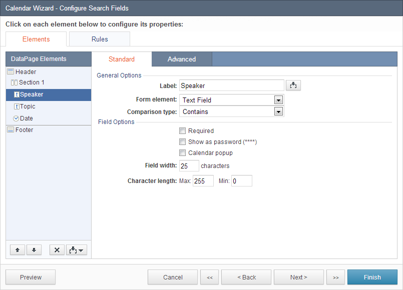
In the Advanced tab you can configure the field layout options and External Associations and Defaults. Layout Options:- By default, every form field starts on a new line. Check Continue next element on same line to place multiple fields on one line.
- You can override the default label position and specify another one using the Label Position dropdown.
- On the Select Results Page Fields screen, you can select the desired fields from your data source to display in your calendar page. An icon on the left of every field indicates the field’s data type. To select fields, move the fields you wish to include from the Available Fields list to the Selected Fields list.
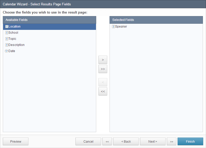
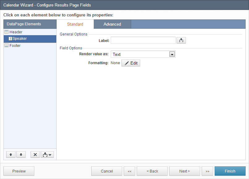
In this scenario, only the Speaker field is displayed on the calendar page. All fields will be selected later for the details page. - On the Configure Results Page Fields, You can render the appearance, formatting and other properties for each field that were selected on the previous screen. Select a field from the DataPage Elements menu on the left and configure field properties on the right. You can insert new elements into your results page, including a HTML Block, Header & Footer, and Calculated fields. In the Advanced tab you can configure layout options for each DataPage Element. By default, every form field starts on a new line. Check Continue next element on same line to place multiple fields on one line. Check Hide field if blank to hide a field when it has a blank value for Display Only fields. You can limit the amount of text by enabling the Truncate option. If enabled, enter a character value to start the text truncation and select an option from the dropdown:
- Characters (nearest word) – Truncates at the end of the last word before the specified limit.
- Characters (exact) – Truncates at the exact number of specified characters, including spaces and line breaks.
- Paragraphs – Truncates at the exact number of paragraphs, as identified by a line break.
Check Allow users to expand/collapse to include an icon or “More…” link for users to view the truncated text. You can choose a particular icon in Styles or customize the text link in Localizations.
If the Formulas and Calculations feature is available on your account, you can use the Grouping tab to group fields by one or more fields and customize the grouping display with the standard or collapsible option.
In this scenario, a Header & Footer is inserted to display a heading title. The label for the Speaker field is removed, so the field name will not display on the calendar.
- On the Search Results Options screen you can customize the appearance and functionality of your Calendar page. You can configure the calendar options, display options, and interactive options.
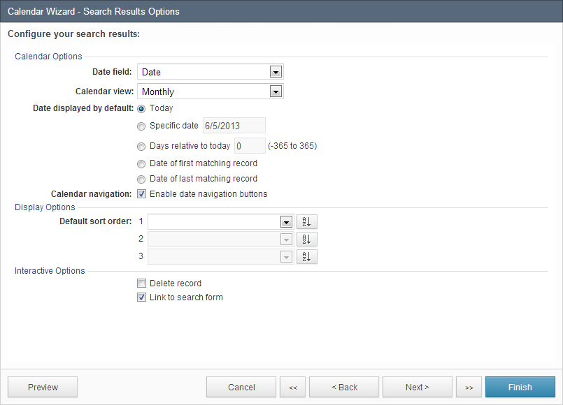
- In the Calendar Options section, you can apply the following:
- Date field – Select the column in your table which will be used to place results within your Calendar.
- Calendar view – Choose between a monthly and weekly view.
- Date displayed by default – Select the date that should be visible on the default view of your Calendar.
- Today – The current date is shown on your Calendar.
- Specific date – The date you select is shown on your Calendar.
- Days relative to today – This option will show a Calendar in the past or in the future based on the number of days you select.
- Date of first matching record – The Calendar shows the earliest entry in your result set.
- Date of latest matching record – The Calendar shows the most recent entry in your result set.
- Enable date navigation buttons – These buttons allow your users to navigate to previous and future dates from your Calendar. In the monthly view, you can navigate by month and year. In the weekly view, you can navigate by week and month.
- In the Display Options section, you can configure the following:
- Default sort order – Select which fields to sort and choose to sort by Ascending or Descending order with the toggle buttons. Up to three fields can be used for sorting. You have the option to sort search results by fields that are not selected to display on the results page.
- In the Interactive Options section, the following options can be checked:
- Interactive sorting – Let users sort results in any column by clicking the column’s header or by customizing a list of specific sorting fields in a dropdown menu. If the second option is enabled, you can configure the dropdown label for each field, sort each field in ascending or descending order, order the fields in the dropdown, position the dropdown menu, and preview how the dropdown menu will be displayed.
- Delete record – Allow users to delete records.
- In this scenario, all settings are left at default. You have the option to add a details page to your Calendar DataPage that is linked to each search result. The details page displays information for a specific record that was selected from the results page.
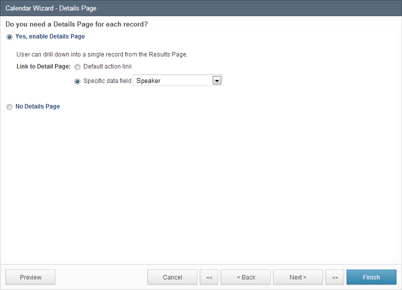
- To enable a details page, check Yes, enable Details Page. Select Default action link for Caspio to provide an additional link to each record or select Specific data field and select a field for the details page link to be embedded within the selected field.In this scenario, it is ideal for an end-user to click an event on the calendar page and view additional event information on the details page. Check Yes, enable Details Page. Check Specific data field and select Speaker from the dropdown.
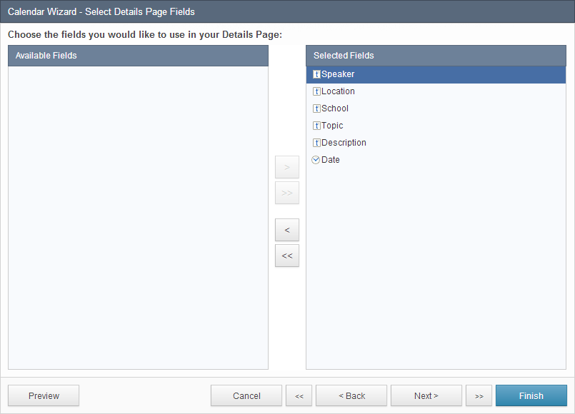
- On the Select Details Page Fields screen you can choose the fields you want to use in your details page. To select fields, move the fields from the Available Fields list to the Selected Fields list.
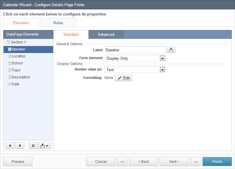
- On the Configure Details Page Fields screen you can configure how the fields will be displayed in your details page. Select a field from the DataPage Elements list to customize the field’s display and functionality properties. In this scenario, no customization options were configured.
- On the Details Page Options, you can choose to enable additional functionality in your details page. The options are described below:
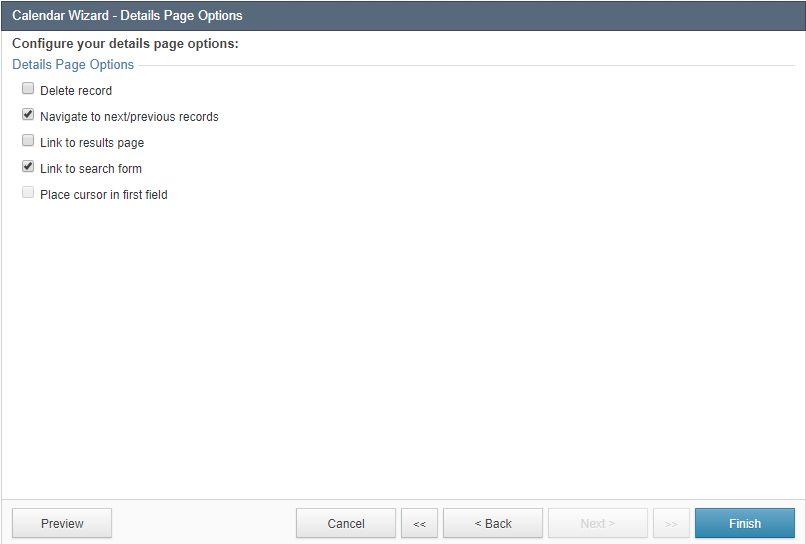
- Delete record – Allow users to delete records. While this option is not recommended for publicly-accessible DataPages, you may consider enabling this for internal use. Deleted records are permanently removed from your table.
- Navigate to next/previous records – Add controls on the details page to go to the next or previous record based on the order displayed in the search results. You can modify the color and styles in the Style associated with this DataPage.
- Link to results page – Allows users to go to the results page.
- Link to search form – Allow users to return to the search form with a provided link or button. You can customize the link into an icon in Styles or format the text link in Localizations.
- Automatically focus cursor on the first field – Automatically place the cursor in the first field of the form when the page loads.
In this scenario, only Link to search form is checked. Click Finish.
You have successfully created a Calendar DataPage with a search form, a results page, and a details page. Click Preview to view your calendar. It should appear with the search form first:
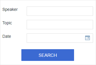
After clicking Search, events are displayed based on your search criteria. Click any speaker name to view the details page of the particular seminar.
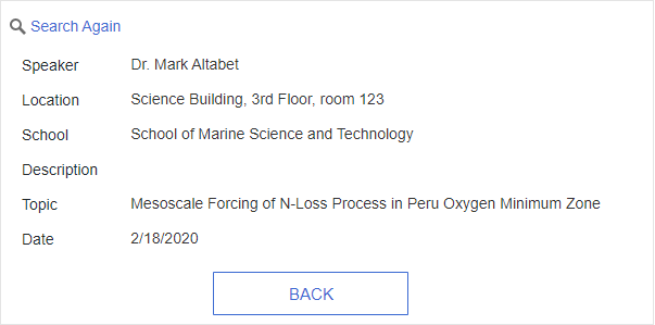
Once a speaker name is clicked, you will be directed to the details page of the selected seminar.

