Creating and Configuring Charts
24 minutes to readLearn how to add and set up charts in your AppPages to make complex data easier to compare and interpret.
Steps to create a chart
- In the upper panel, select the Add elements button.
- In the Charts section, select the type of chart that you want to add.
If you later decide to change the type of your chart, you can always do it from the right panel. - Select the data source and fields that you want to show on the chart:
- In the Data source panel, select a table or view that will be the primary data source for your DataPart.
- From the Available fields panel, select the fields you want to use in your chart. To do that, click the field or drag it into the Selected fields section.
Select two fields for Pie Charts and two or more for other chart types.
Note: Smart logic will distribute the selected fields automatically among settings properties (the x-axis and y-axis) of your chart. You can change the default field distribution in the DataPart settings panel. Learn more.
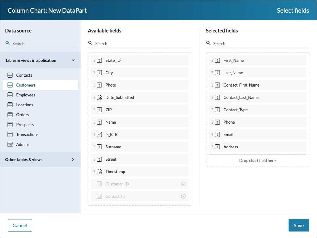
The following image shows the Select fields dialog box for a sample Column Chart:
- Click Save.
Note: You can restrict the visibility of specific records in a chart by managing roles. Learn more.
For Area Chart, you can distribute the fields among X-axis, Series, and Y-axis.
X-axis
The x-axis is a horizontal axis that contains the name or label for your data points. It is used to categorize the values on a chart.
- Click the Settings
 button to modify the axis:
- In the Axis title field, enter a name for the axis.
- For the Axis labels orientation setting, select how you want to display the category labels on this axis. You can select Auto, Horizontal, or Vertical orientation. For the Auto option, labels might be shown at an angle if needed.
- Enter the maximum number of characters for category labels.
- Click Save.
- Add a field to the axis by clicking the Add button above the section.
Note: You can insert only one field for the x-axis. Without inserting any field for the x-axis, your configuration is incomplete.
- For the Date/Time data type fields, choose how you want to group the data based on specific date, time, or period:
- Select the field.
- In the Field settings pane, in the Data grouping list, select the type of grouping you want to use, and then click Save.
For example, by grouping data by month, you can effectively summarize daily sales figures into monthly totals for easier interpretation of long-term trends.
Series
Series group data points from your chart by unique categories taken from the added data source field.
To add a field to Series, click the Add button located above the section.
Note:
- When the fields are added to the Series section, only one aggregation field can be used for the y-axis.
- You can insert only one field in the Series section.
- If you use a series, you can only have one y-axis. If you add a series to a chart with more than one y-axis, the additional y-axes will be removed.
Y-axis
The vertical y-axis aggregates the values from a cross-section of the x-axis and series fields to present them on a chart.
- Click the Settings button to modify the axis:
- In the Axis title field, enter a name for the axis. You can use basic HTML tags to include custom styling.
- For the Axis range setting, select how many values you want to display:
- To automatically scale the range to show all aggregated values, select Auto.
- To scale the range in a nonlinear mode, select Logarithmic.
As a result, the distance between two values on the axis will grow exponentially as the values increase. This option is useful when the data has a wide range of values. - To show a specific range of values, select Fixed, and then enter the values for the start and end of the range.
- For the Axis position setting, specify if you want to position the axis on the left or right of a chart.
- For the Axis labels orientation setting, select how you want to display the category labels on this axis – horizontally or vertically.
- Click Save.
- Add a field to the axis by clicking the Add button above the section. You can insert multiple fields for the y-axis given that the Series section is empty. After adding a field to the y-axis, you can apply additional settings. Select a field added to the y-axis to see the configuration panel.
- In Label, specify the label for a line series.
Note: If a series is used, labels are taken from the data source field added to the Series section.
- In the Function section, select the function that should be applied to the aggregate data points based on a table field. The following functions are available:
- Count – Supports all data types, except Yes/No.
- Count non-blank – Counts only records that contain values. It applies to Text(255), Number, Integer, Currency, Yes/No, Date/Time, Timestamp, and Formula (depending on a formula) data types.
- Count checkbox selected – Counts the total number of selected checkboxes. It applies to Yes/No data types.
- Count checkbox empty – Counts the total number of cleared checkboxes. It applies to the Yes/No data type.
- Sum – Returns the sum of a set of numbers. It applies to Number, Integer, Currency, and Formula (depending on a formula) data types.
- Average – Counts average value from records. It applies to Number, Integer, Currency, and Formula (depending on a formula) data types.
- Max/Min – Gets the maximum or minimum value from records. It applies to Text(255), Number, Integer, Currency, Date/Time, Timestamp, and Formula (depending on a formula) data types.
- None – Shows all numeric values individually without aggregation. It applies to Number, Integer, and Currency data types.
- In Label, specify the label for a line series.
- Optional: If you want to configure more y-axes, click Add y-axis, and then repeat steps 1 to 2.
Note: If you use a series, you can only have one y-axis. If you add more than one y-axis, your series configuration will be removed.
For Bar Chart, you can distribute the fields among Y-axis, Series, and X-axis.
Y-axis
The vertical y-axis aggregates the values from a cross-section of the x-axis and series fields to present them on a chart.
- Click the Settings button to modify the axis:
- In the Axis title field, enter a name for the axis. You can use basic HTML tags to include custom styling.
- For the Axis labels orientation setting, select how you want to display the category labels on this axis. You can select Auto, Horizontal, or Vertical orientation. For the Auto option, labels might be shown at an angle if needed.
- Enter the maximum number of characters for category labels.
- Click Save.
- Add a field to the axis by clicking the Add button above the section.
Note: You can insert only one field for the y-axis. Without inserting any field for the x-axis, your configuration is incomplete.
- For the Date/Time data type fields, choose how you want to group the data based on specific date, time, or period:
- Select the field.
- In the Field settings pane, in the Data grouping list, select the type of grouping you want to use, and then click Save.
For example, by grouping data by month, you can effectively summarize daily sales figures into monthly totals for easier interpretation of long-term trends.
Series
Series group data points from your chart by unique categories taken from the added data source field.
To add a field to Series, click the Add button located above the section.
Note:
- When the fields are added to the Series section, only one aggregation field can be used for the x-axis.
- You can insert only one field in the Series section.
- If you use a series, you can only have one x-axis. If you add a series to a chart with more than one x-axis, the additional x-axes will be removed.
You can insert only one field in the Series section.
X-axis
The x-axis is a horizontal axis that contains the name or label for your data points. It is used to categorize the values on a chart.
- Click the Settings button to modify the axis:
- In the Axis title field, enter a name for the axis.
- For the Axis range setting, select how many values you want to display:
- To automatically scale the range to show all aggregated values, select Auto.
- To scale the range in a nonlinear mode, select Logarithmic.
As a result, the distance between two values on the axis will grow exponentially as the values increase. This option is useful when the data has a wide range of values. - To show a specific range of values, select Fixed, and then enter the values for the start and end of the range.
- For the Axis position setting, specify if you want to position the axis on the bottom or top of a chart.
- For the Axis labels orientation setting, select how you want to display the category labels on this axis – horizontally or vertically.
- Click Save.
- Add a field to the axis by clicking the Add button above the section. You can insert multiple fields for the x-axis given that the Series section is empty. After adding a field to the x-axis, you can apply additional settings. Select a field added to the x-axis to see the configuration panel.
- In Label, specify the label for a line series.
Note: If a series is used, labels are taken from the data source field added to the Series section.
- In the Function section, select the function that should be applied to the aggregate data points based on a table field. The following functions are available:
- Count – Supports all data types, except Yes/No.
- Count non-blank – Counts only records that contain values. It applies to Text(255), Number, Integer, Currency, Yes/No, Date/Time, Timestamp, and Formula (depending on a formula) data types.
- Count checkbox selected – Counts the total number of selected checkboxes. It applies to Yes/No data types.
- Count checkbox empty – Counts the total number of cleared checkboxes. It applies to the Yes/No data type.
- Sum – Returns the sum of a set of numbers. It applies to Number, Integer, Currency, and Formula (depending on a formula) data types.
- Average – Counts average value from records. It applies to Number, Integer, Currency, and Formula (depending on a formula) data types.
- Max/Min – Gets the maximum or minimum value from records. It applies to Text(255), Number, Integer, Currency, Date/Time, Timestamp, and Formula (depending on a formula) data types.
- None – Shows all numeric values individually without aggregation. It applies to Number, Integer, and Currency data types.
- In Label, specify the label for a line series.
- Optional: If you want to configure more x-axes, click Add x-axis, and then repeat steps 1 to 2.
Note: If you use a series, you can only have one x-axis. If you add more than one x-axis, your series configuration will be removed.
For Column Chart, you can distribute the fields among X-axis, Series, and Y-axis.
X-axis
The x-axis is a horizontal axis that contains the name or label for your data points. It is used to categorize the values on a chart.
- Click the Settings button to modify the axis:
- In the Axis title field, enter a name for the axis.
- For the Axis labels orientation setting, select how you want to display the category labels on this axis. You can select Auto, Horizontal, or Vertical orientation. For the Auto option, labels might be shown at an angle if needed.
- Enter the maximum number of characters for category labels.
- Click Save.
- Add a field to the axis by clicking the Add button above the section.
Note: You can insert only one field for the x-axis. Without inserting any field for the x-axis, your configuration is incomplete.
- For the Date/Time data type fields, choose how you want to group the data based on specific date, time, or period:
- Select the field.
- In the Field settings pane, in the Data grouping list, select the type of grouping you want to use, and then click Save.
For example, by grouping data by month, you can effectively summarize daily sales figures into monthly totals for easier interpretation of long-term trends.
Series
Series group data points from your chart by unique categories taken from the added data source field.
To add a field to Series, click the Add button located above the section.
Note:
- When the fields are added to the Series section, only one aggregation field can be used for the y-axis.
- You can insert only one field in the Series section.
- If you use a series, you can only have one y-axis. If you add a series to a chart with more than one y-axis, the additional y-axes will be removed.
Y-axis
The vertical y-axis aggregates the values from a cross-section of the x-axis and series fields to present them on a chart.
- Click the Settings button to modify the axis:
- In the Axis title field, enter a name for the axis. You can use basic HTML tags to include custom styling.
- For the Axis range setting, select how many values you want to display:
- To automatically scale the range to show all aggregated values, select Auto.
- To scale the range in a nonlinear mode, select Logarithmic.
As a result, the distance between two values on the axis will grow exponentially as the values increase. This option is useful when the data has a wide range of values. - To show a specific range of values, select Fixed, and then enter the values for the start and end of the range.
- For the Axis position setting, specify if you want to position the axis on the left or right of a chart.
- For the Axis labels orientation setting, select how you want to display the category labels on this axis – horizontally or vertically.
- Click Save.
- Add a field to the axis by clicking the Add button above the section. You can insert multiple fields for the y-axis given that the Series section is empty. After adding a field to the y-axis, you can apply additional settings. Select a field added to the y-axis to see the configuration panel.
- In Label, specify the label for a line series.
Note: If a series is used, labels are taken from the data source field added to the Series section.
- In the Function section, select the function that should be applied to the aggregate data points based on a table field. The following functions are available:
- Count – Supports all data types, except Yes/No.
- Count non-blank – Counts only records that contain values. It applies to Text(255), Number, Integer, Currency, Yes/No, Date/Time, Timestamp, and Formula (depending on a formula) data types.
- Count checkbox selected – Counts the total number of selected checkboxes. It applies to Yes/No data types.
- Count checkbox empty – Counts the total number of cleared checkboxes. It applies to the Yes/No data type.
- Sum – Returns the sum of a set of numbers. It applies to Number, Integer, Currency, and Formula (depending on a formula) data types.
- Average – Counts average value from records. It applies to Number, Integer, Currency, and Formula (depending on a formula) data types.
- Max/Min – Gets the maximum or minimum value from records. It applies to Text(255), Number, Integer, Currency, Date/Time, Timestamp, and Formula (depending on a formula) data types.
- None – Shows all numeric values individually without aggregation. It applies to Number, Integer, and Currency data types.
- In Label, specify the label for a line series.
- Optional: If you want to configure more y-axes, click Add y-axis, and then repeat steps 1 to 2.
Note: If you use a series, you can only have one y-axis. If you add more than one y-axis, your series configuration will be removed.
For Combination Chart, you can distribute the fields among X-axis and Y-axis.
X-axis
The x-axis is a horizontal axis that contains the name or label for your data points. It is used to categorize the values on a chart.
- Click the Settings button to modify the axis:
- In the Axis title field, enter a name for the axis.
- For the Axis labels orientation setting, select how you want to display the category labels on this axis. You can select Auto, Horizontal, or Vertical orientation. For the Auto option, labels might be shown at an angle if needed.
- Enter the maximum number of characters for category labels.
- Click Save.
- Add a field to the axis by clicking the Add button above the section.
Note: You can insert only one field for the x-axis. Without inserting any field for the x-axis, your configuration is incomplete.
- For the Date/Time data type fields, choose how you want to group the data based on specific date, time, or period:
- Select the field.
- In the Field settings pane, in the Data grouping list, select the type of grouping you want to use, and then click Save.
For example, by grouping data by month, you can effectively summarize daily sales figures into monthly totals for easier interpretation of long-term trends.
Y-axis
The y-axis is as a reference for the quantitative data points of data series taken from the x-axis.
- Click the Settings button to modify the axis:
- In the Axis title field, enter a name for the axis. You can use basic HTML tags to include custom styling.
- For the Axis range setting, select how many values you want to display:
- To automatically scale the range to show all aggregated values, select Auto.
- To scale the range in a nonlinear mode, select Logarithmic.
As a result, the distance between two values on the axis will grow exponentially as the values increase. This option is useful when the data has a wide range of values. - To show a specific range of values, select Fixed, and then enter the values for the start and end of the range.
- For the Axis position setting, specify if you want to position the axis on the left or right of a chart.
- For the Axis labels orientation setting, select how you want to display the category labels on this axis – horizontally or vertically.
- Click Save.
- Add a field to the axis by clicking the Add button above the section. After adding a field to the y-axis, you can apply additional settings. Select a field added to the y-axis to see the configuration panel.
- In Label, specify the label for a line series.
- In the Function section, select the function that should be applied to the aggregate data points based on a table field. The following functions are available:
- Count – Supports all data types, except Yes/No.
- Count non-blank – Counts only records that contain values. It applies to Text(255), Number, Integer, Currency, Yes/No, Date/Time, Timestamp, and Formula (depending on a formula) data types.
- Count checkbox selected – Counts the total number of selected checkboxes. It applies to Yes/No data types.
- Count checkbox empty – Counts the total number of cleared checkboxes. It applies to the Yes/No data type.
- Sum – Returns the sum of a set of numbers. It applies to Number, Integer, Currency, and Formula (depending on a formula) data types.
- Average – Counts average value from records. It applies to Number, Integer, Currency, and Formula (depending on a formula) data types.
- Max/Min – Gets the maximum or minimum value from records. It applies to Text(255), Number, Integer, Currency, Date/Time, Timestamp, and Formula (depending on a formula) data types.
- None – Shows all numeric values individually without aggregation. It applies to Number, Integer, and Currency data types.
- Optional: If you want to configure more y-axes, click Add y-axis, and then repeat steps 1 to 2.
For Line Chart, you can distribute the fields among X-axis, Series, and Y-axis.
X-axis
The x-axis is a horizontal axis that contains the name or label for your data points. It is used to categorize the values on a chart.
- Click the Settings button to modify the axis:
- In the Axis title field, enter a name for the axis.
- For the Axis labels orientation setting, select how you want to display the category labels on this axis. You can select Auto, Horizontal, or Vertical orientation. For the Auto option, labels might be shown at an angle if needed.
- Enter the maximum number of characters for category labels.
- Click Save.
- Add a field to the axis by clicking the Add button above the section.
Note: You can insert only one field for the x-axis. Without inserting any field for the x-axis, your configuration is incomplete.
- For the Date/Time data type fields, choose how you want to group the data based on specific date, time, or period:
- Select the field.
- In the Field settings pane, in the Data grouping list, select the type of grouping you want to use, and then click Save.
For example, by grouping data by month, you can effectively summarize daily sales figures into monthly totals for easier interpretation of long-term trends.
Series
Series group data points from your chart by unique categories taken from the added data source field.
To add a field to Series, click the Add button located above the section.
Note:
- When the fields are added to the Series section, only one aggregation field can be used for the y-axis.
- You can insert only one field in the Series section.
- If you use a series, you can only have one y-axis. If you add a series to a chart with more than one y-axis, the additional y-axes will be removed.
Y-axis
The vertical y-axis aggregates the values from a cross-section of the x-axis and series fields to present them on a chart.
- Click the Settings button to modify the axis:
- In the Axis title field, enter a name for the axis. You can use basic HTML tags to include custom styling.
- For the Axis range setting, select how many values you want to display:
- To automatically scale the range to show all aggregated values, select Auto.
- To scale the range in a nonlinear mode, select Logarithmic.
As a result, the distance between two values on the axis will grow exponentially as the values increase. This option is useful when the data has a wide range of values. - To show a specific range of values, select Fixed, and then enter the values for the start and end of the range.
- For the Axis position setting, specify if you want to position the axis on the left or right of a chart.
- For the Axis labels orientation setting, select how you want to display the category labels on this axis – horizontally or vertically.
- Click Save.
- Add a field to the axis by clicking the Add button above the section. You can insert multiple fields for the y-axis given that the Series section is empty. After adding a field to the y-axis, you can apply additional settings. Select a field added to the y-axis to see the configuration panel.
- In Label, specify the label for a line series.
Note: If a series is used, labels are taken from the data source field added to the Series section.
- In the Function section, select the function that should be applied to the aggregate data points based on a table field. The following functions are available:
- Count – Supports all data types, except Yes/No.
- Count non-blank – Counts only records that contain values. It applies to Text(255), Number, Integer, Currency, Yes/No, Date/Time, Timestamp, and Formula (depending on a formula) data types.
- Count checkbox selected – Counts the total number of selected checkboxes. It applies to Yes/No data types.
- Count checkbox empty – Counts the total number of cleared checkboxes. It applies to the Yes/No data type.
- Sum – Returns the sum of a set of numbers. It applies to Number, Integer, Currency, and Formula (depending on a formula) data types.
- Average – Counts average value from records. It applies to Number, Integer, Currency, and Formula (depending on a formula) data types.
- Max/Min – Gets the maximum or minimum value from records. It applies to Text(255), Number, Integer, Currency, Date/Time, Timestamp, and Formula (depending on a formula) data types.
- None – Shows all numeric values individually without aggregation. It applies to Number, Integer, and Currency data types.
- In Label, specify the label for a line series.
- Optional: If you want to configure more y-axes, click Add y-axis, and then repeat steps 1 to 2.
Note: If you use a series, you can only have one y-axis. If you add more than one y-axis, your series configuration will be removed.
For Pie Chart, you can distribute the fields among Category and Value sections.