Generating Geocharts
4 minutes to read
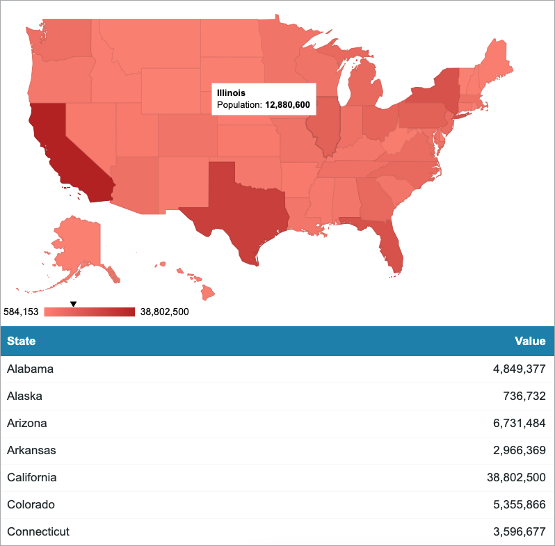
Geocharts are powerful tools for displaying geographical data in an interactive and visually appealing manner. Whether you are tracking sales across different regions, monitoring population distribution, or analyzing global trends, geocharts provide a clear and intuitive representation of data on maps. Using a geochart on a dashboard or in a reporting tool can give you valuable insights into spatial patterns.
In this article, we will explore how to create a dynamic geochart to visually represent geographical data to display the population of each USA state using the Google Chart Library (GeoChart).
 Steps:
Note: Depending on the data that you want to display, this configuration might require a Google developer key.
Steps:
- In your table, add fields with the geographical data that you want to present. For example, include one field for storing US state names (State), and one for storing the population count for every state (Population).
- On a Report DataPage, on the Search and Report Wizard – Configure Results Page Fields screen, in the lower-right corner of the DataPage Elements panel, click the Insert button
 , and then add a calculated field.
 - In the Formula section, insert an SQL statement to get the values from your table as an array.
For example, the statement below selects the State and Population value fields from the “States_GeoChart” table.
Note: The
CONVERTtoVARCHARdata type is used because the Population field is a number in the “States_GeoChart” table. All fields inside the following formula must use this statement if they are not stored as the Text data type.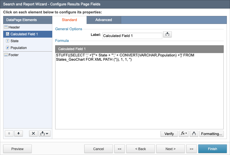
- In the lower-right corner of the DataPage Elements panel, click the Insert button , and then add a Header & Footer.
- In the header of the DataPage, disable the HTML editor, and then add the following HTML/CSS code to hide the values of the calculated field added in step 3.
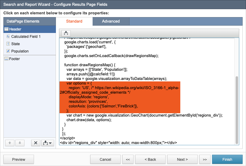
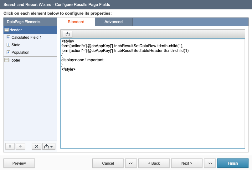 In this example, the first column in the report is the calculated field, which is represented by “1” in each line.
 - Display the geochart by adding the following JavaScript below the code segment added in step 5. Replace
1in the[@calcfield:1!]value (highlighted in the following screenshot) with the number of your calculated field: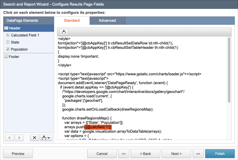
- Optional: Customize the options object in the code above to change the displayed country, the range of colors, and so on.
For more information on customizing geocharts, see Google Charts help.
- Click Finish.
Note: This article uses external HTML, JavaScript, or third-party solutions to add functionality outside of Caspio Bridge’s standard feature set. These solutions are provided “as is” without warranty, support, or guarantee. The code within this article is provided as a sample to assist you in the customization of your web applications. You may need a basic understanding of HTML and JavaScript to implement successfully. For assistance with further customization based on your specific application requirements, please contact our Professional Services team.