Responsive Behavior on Tablet and Mobile
2 minutes to readConsider the following UI behaviors on tablet and mobile screens when building applications.
Caspio DataPages re-size according to the width of the screen that is used to access the app. Caspio uses the following screen width thresholds:
- 320px – 567px – mobile devices
- 568px – 1024px – tablet devices
- 1025px and above – desktops and laptops
Web Forms
The following changes are applied to forms:
For tablet screens:
- The form is presented as one column
- Inputs are stretched to full width
- Labels are displayed on top of the inputs
- Images are downscaled to fit the width of the screen
For mobile screens:
- The form is presented as one column
- Inputs are stretched to full width
- Labels are displayed on top of the inputs
- Images are downscaled to fit the width of the screen
- Action buttons (Submit/Update/Delete/Back) are stretched to full width
Reports
The following changes are applied to reports:
For tablet screens:
- Pagination and records count elements are center aligned
- Pagination with the “Jump to page” option (see Interactive Reporting Options) are shown in a dropdown
- Inline actions are available from the menu on the right
- Select record checkbox is moved to the first column
- In List/Gallery Report records are displayed in one column
For mobile screens:
- Delete, bulk edit and grid edit options are not displayed
- Search and Inline Insert options are displayed as buttons
- Pagination is only displayed as “Jump to page” dropdown
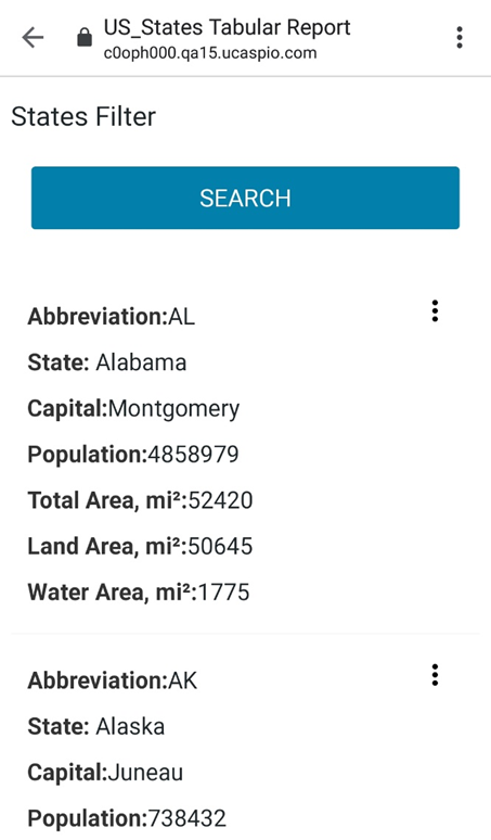
- In Tabular reports, each record is displayed as a separate card
- Field label and data appear in the same line. Field label is in bold and has a colon separator.
- In List/Gallery Reports the records are displayed in one column
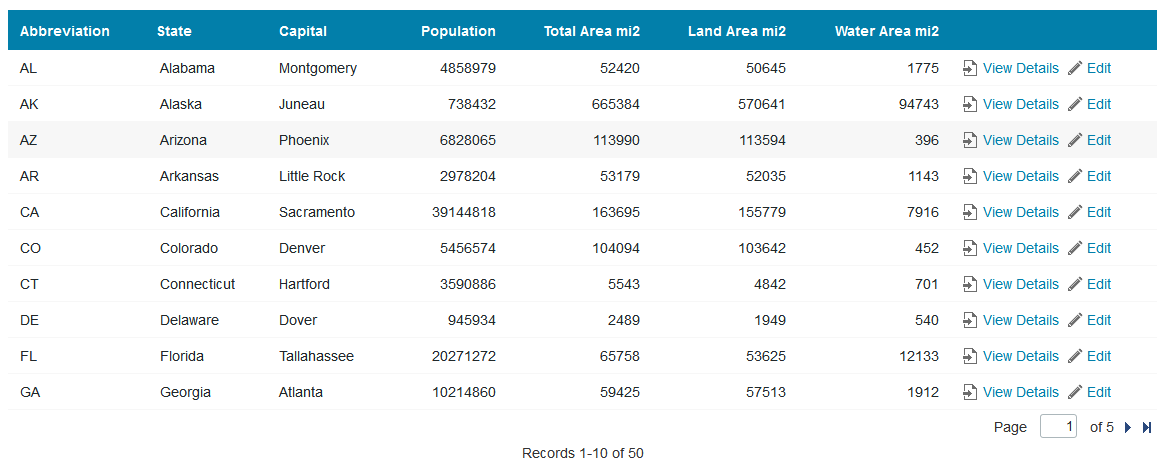
Tabular Report on desktop:

Tabular Report on tablet:

Tabular Report on mobile:

Calendars
The following changes are applied to calendars:
For tablet and mobile screens:
- All records (events) are displayed in one column
- Navigation panel is available at the top
- Inline actions are available from the menu on the right
Charts
Charts are not changed on tablets. The following changes are applied to mobile screens:
- Subtitles and legend titles are not shown
- Legends are shown at the bottom
- Numeric values by the vertical axis are shortened

