Themes and Widgets
2 minutes to readThemes define the overall visual style of your application across its AppPages. A theme controls the appearance of interface elements, including colors, fonts, sizes, spacing, and other design attributes. When a theme is applied, it ensures a consistent look and feel throughout the app.
Each theme includes styling rules that automatically affect all AppPages using that theme. This allows you to maintain visual consistency and update the design of your application centrally, without modifying individual pages.
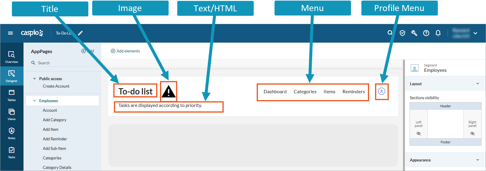
The elements that you add to the four standard sections of a segment (header, footer, left and right panels) are called widgets. Widgets are independent user interface components that provide specific functionality. Once included in a theme, you can reuse them across all AppPages that use that theme.
The following image shows a sample canvas with several widgets:
