In Caspio, you can monitor your current usage of resources available in your account. Depending on the resource type, you can view monthly and daily usage and limits, display usage trends in charts or download data in Excel or CSV file format.
Accessing Usage Statistics
- On any Caspio screen, navigate to the main menu bar and click the Account icon
 > Plan and billing.
 - Select the Usage tab to view your current usage statistics. Each tile shows the usage of a given account in relation to its overall allocation.
The following states correspond to the color of usage lines:
- Green – unlimited resource allocation.
- Blue – current usage is within a limit.
- Orange – the usage is close to the limit.
- Red – the usage exceeds the limit.
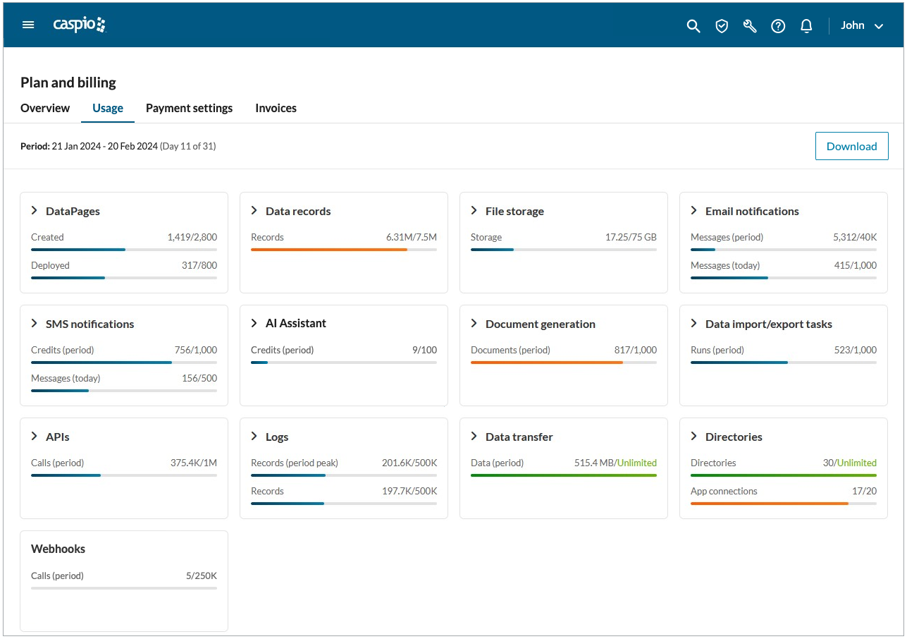
Note: The resource tiles absent from your Caspio plan do not appear in your usage statistics. For more information, see Caspio plans and pricing.
DataPages, Data records, File storage and Logs show current usage of a resource since it has been available for an account.
Email and SMS notifications, Document generation, Data import/export tasks, APIs and Data transfer show usage of a resource since the beginning of the current usage period.
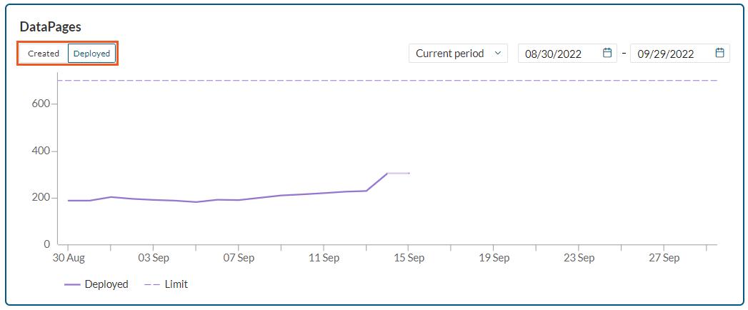
DataPages
The number of created and deployed DataPages. Learn more about DataPages.
Data records
The number of records stored in your tables.
File storage
Storage capacity for all files uploaded to your Caspio account.
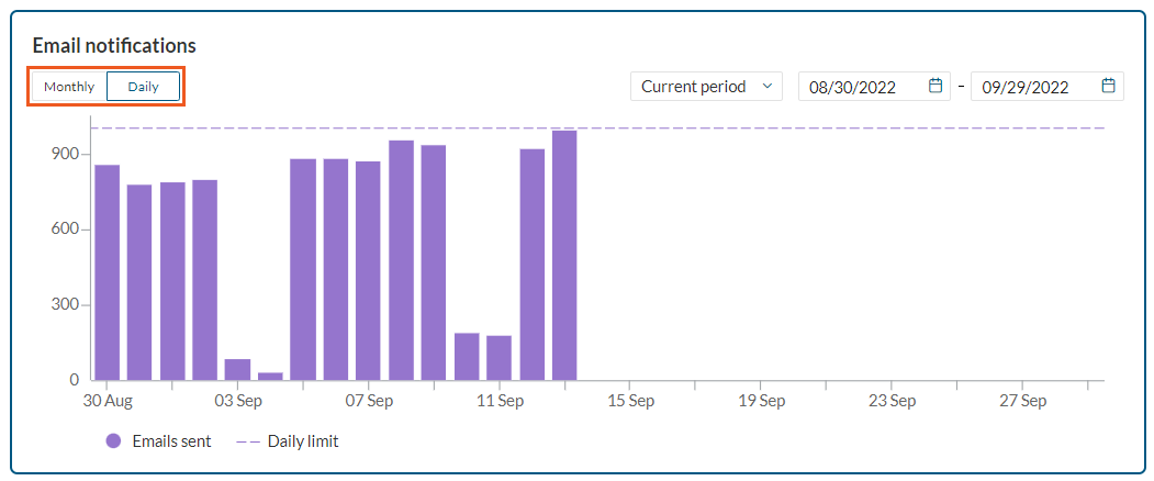
Email notifications
The number of automatic emails generated by DataPages (Acknowledgment and Notification Emails), Triggered Actions, and Tasks. This section shows the number of messages generated on a given day and within a certain period. Learn more about email notifications.
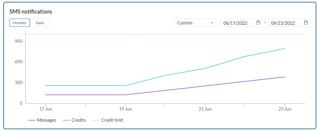
SMS notifications
SMS notifications generated by DataPages as well as Triggered Actions and Application Tasks. This section shows the SMS cost counted in credits and the number of SMS messages generated on a given day. Learn more about SMS notifications.
AI Assistant
The number of credits used for AI Assistant requests (including the Regenerate option). Learn more about AI Assistant.
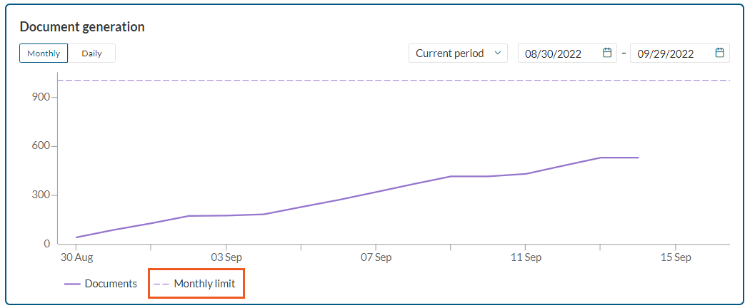
Document generation
The number of generated PDF documents from Document templates. Learn more about document generation.
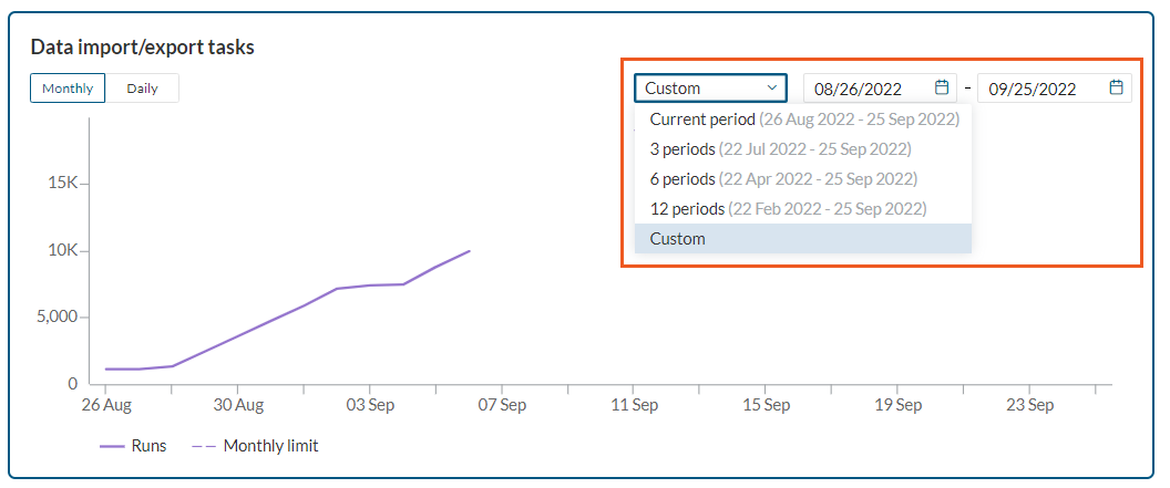
Data import/export tasks
The number of Data import/export tasks executed in the current usage period. Learn more about data import/export tasks.
APIs
The number of Rest API calls from your applications in the current usage period. Learn more about Web Services API.
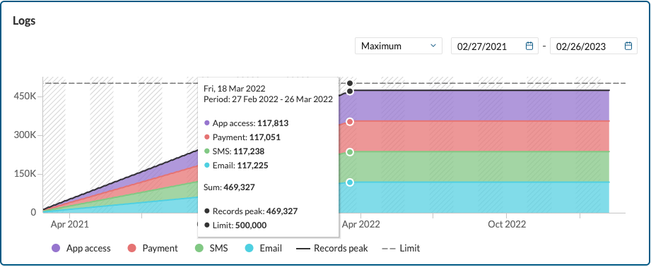
Logs
The sum of all records stored in your App access, Payment, Email, and SMS logs. Learn more about logs.
Data transfer
Whenever your end users submit or retrieve data through your apps, data is transferred between Caspio’s servers and the users. The accumulation of data transferred in each interaction through apps, APIs, and import/export determines your data transfer per period.
Directories
The number of directories created within your account and the total number of app connections in all directories. Learn more about Directories.
Webhooks
The number of webhook calls sent in the current usage period. Learn more about Webhooks.
Managing usage charts
Usage charts are graphical depictions of resource usage. Depending on the resource type, you can monitor daily or monthly resource usage on the chart. To view the usage chart, click on the tile of a given resource.
Selecting time range
You can select the period(s) for which you want to display the data by choosing the exact period or custom range of dates from a dropdown. For charts with multiple cycles available, background shading indicates the start and end of a given period.
Note: The available periods depend on the length of your account history.
Viewing data against the limit
The limit line appears by default for all charts with a resource limit. It is possible to hide and show it as needed. To do that, click Limit on the chart legend. Hiding the chart line may be especially helpful in case you need to make the chart with low values but high limit more readable.
Zooming the data in and out
Select the specific area of a chart to zoom in to the lower level of granularity. You can return to the original chart view by clicking the Reset zoom button. 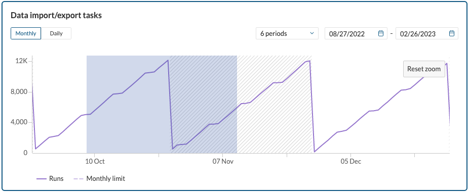
Navigating between daily and monthly usage
For selected resources, you can navigate between daily and monthly usage. Select the Daily or Monthly button to see the relevant chart.
- For SMS notifications, you can compare the number of messages sent against the credits.
- For DataPages, it is possible to see separate charts for created and deployed DataPages. Select the Created or Deployed button to see a relevant chart.
- Logs area chart depicts changes in logs usage over time, the sum of selected logs, and the records’ peak (the highest usage) for a given period. You can select between all log types, that is App access, Payment, SMS, and Email logs.