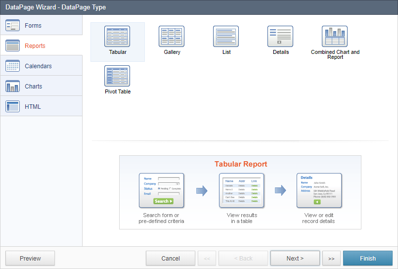
Report DataPages are multi-page interfaces that provide the following high-level capabilities, most of which can be individually enabled or disabled:
- An interactive search form or pre-defined search criteria
- A results screen where matching records are displayed in a tabular, list, grid or other layout
- A drill-down capability to display a single record in detail
- Ability to allow data modification on results and details pages
- Ability to enable and configure automatic notification and acknowledgement email and SMS messages when data is modified
On the next screen you can configure the following. Most of these settings can be changed later easily:
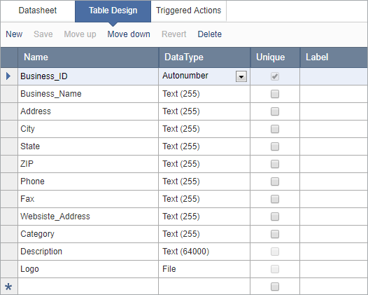
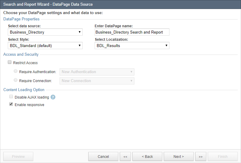
- Select a Table or View that will be the primary data source for your DataPage.
- Name your DataPage or use the suggested name.
- Select a Style or use the default. It determines the formatting and colors of your DataPage but can be changed easily later.
- Select a Localization or use the default. It determines DataPage time zone, formatting for numbers, currency and date, and language of DataPage messages. You can always edit or create a new Localization object and easily change the localization of any DataPage.
- Restrict access to this DataPage based on an Authentication or Connection. Without this option, the DataPage will be accessible without any restriction.
- Authentication: Authorized users will be able to access the DataPage after successfully signing in. Learn more about Authentications.
- Connection: Public users will be able to access your DataPage using their social profile account (Google, Twitter, etc.). This is not a security feature. Learn more about Connections.
- Enable or disable AJAX loading. For more information, see AJAX Loading.
- Leave the Enable responsive checkbox as selected. Responsive DataPages dynamically adapt to various screen sizes for mobile and tablet-friendly display.
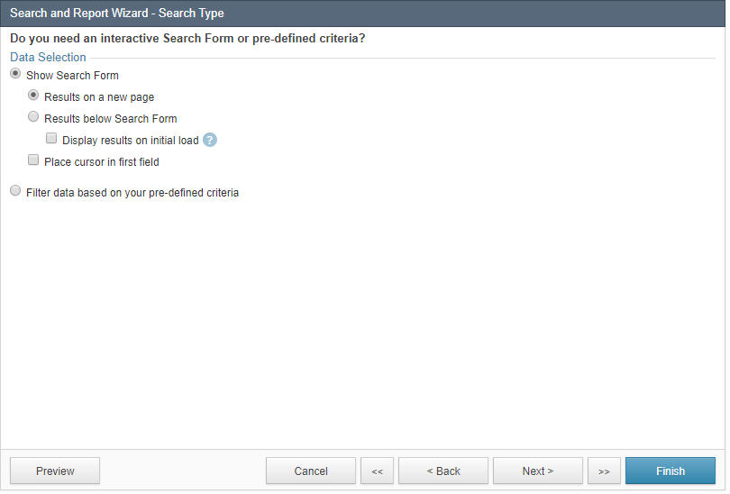
On the next screen, you can choose whether data is filtered via an interactive search form or predefined criteria. You can allow users to use a search form to perform ad hoc searches. When you use a search form, you can display the search form and results on separate screens or display the search form above the results.
The Display results on initial load option makes it possible to automatically display default-criteria results before users perform a search.
On the other hand, a Search Form with pre-defined criteria or no criteria at all displays data based on your configuration. For example, you can use the pre-defined criteria to show all records “Pending” to be approved.
If a Report DataPage is restricted through an Authentication or a Connection, you will also have the option to enable Record Level Security, which when configured, can restrict a user to only see the records authorized to them. For example when building a report for a CRM application you can use this feature to let each sales person only see their contacts and not the contacts of other sales people. Learn more about Record Level Security.
Configuring the Search Form
In our example, we checked Show Search Form and Results on a new page. Because we did not assign an Authentication or Connection in the prior screen, the Record Level Security option is not displayed.
On the next screen we can select the search fields that we want to make available to our app users. The search form requires at least one search field.
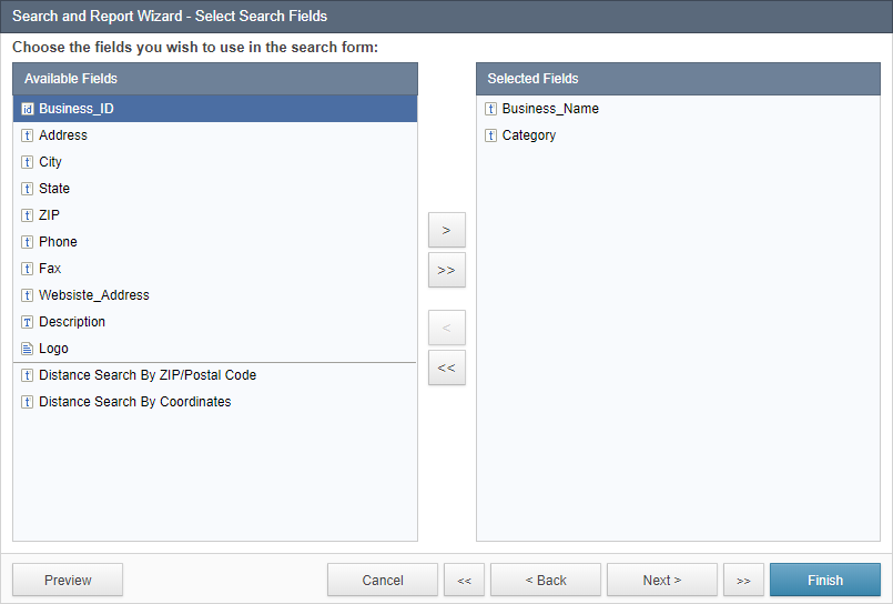
In this example, Business_Name and Category fields are selected.
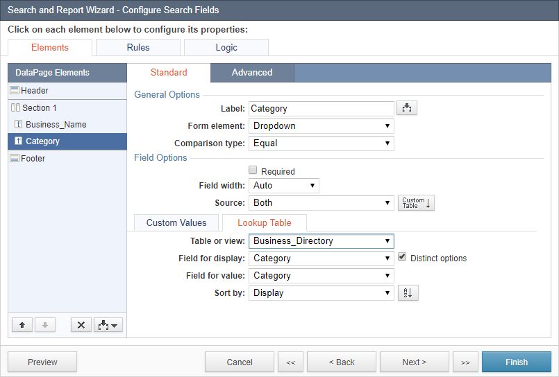
On the next screen we can configure the properties of each search field. Select a field from the DataPage Elements list on the left and configure its properties on the right.
You can also insert other elements into your search form using the Insert button  . Options include:
- New Criteria – insert new criteria on a field to filter the field by two boundaries. For example for a Date field you can have two Criteria, FROM and TO so users can search for records that fall within a specific date range. Or, in a predefined criteria report, you can use multiple criteria on a field such as State to filter records from multiple states simultaneously, such as Customers that are in California or in Nevada.
- New Section – allows you to segment a large form into sections. Within a section you can define specific properties such as number of columns in which fields are organized, and label positioning.
- HTML Block – these blocks are used to insert snippets of HTML or JavaScript code. Common use cases are for subtitles or helpful instructions within a form.
- Virtual Field – these fields work like other form elements but are not bound to the underlying table. Common use cases in search forms are to capture information that is for displaying on the next page or for passing to other DataPages or apps.
- Header & Footer – these work similar to HTML Blocks except that they are fixed to the top and bottom of the DataPage and are outside the DataPage container.
- CAPTCHA – human verification mechanism that is used to prevent programmatic access to your DataPage, such as by bots used for data harvesting.
- Distance Search – if your account includes this feature, this option allows you to add proximity search capability to your DataPage.
On the Standard tab, you can configure properties such as the field label, form element type and comparison type. Other options depend on the field data type and the form element chosen. Additional options include whether a field is required or not, acceptable range of values, the visual size of the field and the acceptable number of characters, etc.
In this example, we have added Header and Footer to the search form in order to add a title. We have left all other settings at their defaults.
For Business_Name field we have chosen form element Text and comparison type Contains. For Category field we have used a dropdown with comparison type set to Equal. Learn how to add an "Any" option to the top of a dropdown or listbox.
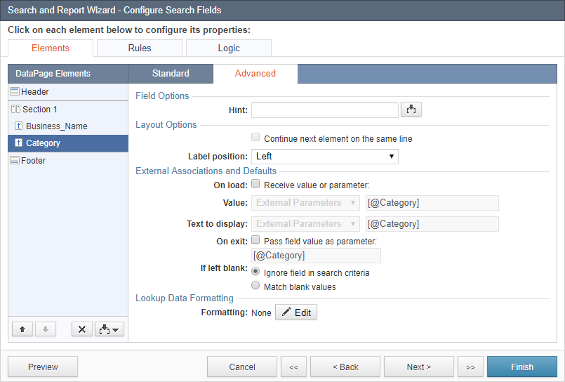
On the Advanced tab, you can configure the following properties:
Field Options
- Placeholder – text that is displayed inside the input field before the user has entered anything.
- Hint – used for short helpful information about the field. When used, a help icon appears next to the label of the field. By hovering over this icon the user can see a short help.
Layout Options
- By default, every form field starts on a new line. Check Continue next element on same line to place multiple fields on one line. Also note that you can use Columns in Sections to organize fields of the section in properly aligned columns. Learn more about multi-column and section options.
- The Label position option allows you to override the setting inherited from the section.
External Associations and Defaults
The options under External Associations and Defaults are advanced topics that are not used in most Reports. They allow you to assign default values for your fields, receive or pass parameters, and customize or edit parameter names.
- To set a default value or receive a parameter in a field, enable the On load option by checking Receive value or parameter. Enter a default value in the space provided or you can choose to receive App Parameters, External Parameters, System Parameters, Authenticated Fields, and Connection Fields.
- To pass a parameter to the next page, enable the On exit option by checking Pass field value as parameter and enter the parameter name. The placeholder text in gray shows you how parameter names should be entered.
On the Rules tab, you can define conditional behavior to hide, show, require or disable fields based on conditions. Learn more about Rules.
On the Logic tab, you can configure the logical operators between the search criteria.
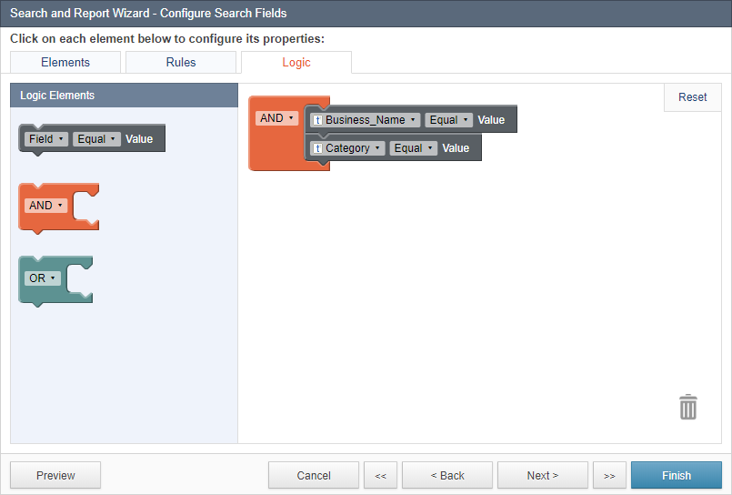
The default operator between all the search form fields or criteria is AND, which means that records in the results set meet all the criteria. However, the Logic tab provides you with an unlimited way to create complex logic in the way the search works.
The Logic tab has an element list on the left and a canvas on the right. Initially all your search fields are grouped in a big AND as it is the default and most common behavior. The logic elements have a small dropdown that can be changed from AND to OR and vice versa. You can drag and drop additional search elements. Note that only the search elements you have previously selected are available to use in the Logic tab. If you need additional criteria on field you must first add it in the Elements tab, and if you need to add or remove fields you must go back one screen.
The logic tab must be correctly setup and there should be no disconnected elements or operators or you won't be able to leave the tab.
To delete an object on the Logic tab, drag it to the trash icon. If the outline of the object turns red when it’s over the trash icon, it is an indication that the object cannot be deleted on this screen and you must remove it from the Elements tab. Every field must be used at least once.
At any time you can click on the Reset button in the Logic tab to return to the original state of the criteria before you started editing.
Note: Some Unicode characters such as emoji are ignored in the search criteria.
Configuring the Results Page
The next screen allows you to select the field you would like to use on the results page.
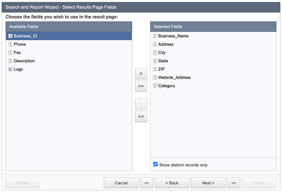
If your data source contains many duplicated records and you want your report to show only the records with the unique combination of selected fields, then select Show distinct records only.
Additional notes about Distinct criteria:
- The maximum allowed number of fields on the Result Page is 10.
- List-String/List-Date/List-Number and Text (64000) data types cannot be used with Distinct criteria.
- Editing, Total & Aggregation, Grouping in Results Pages are not supported if Distinct criteria are enabled.
- Details page cannot be enabled with Distinct criteria.
- Sorting options on the Result page can be based only on the data source fields added to the Result page.
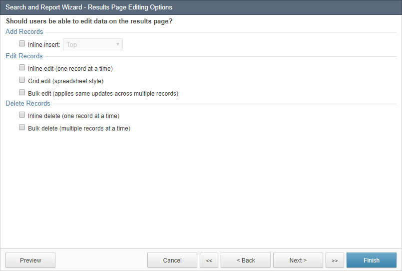
The next step is where you can choose to enable data editing options in the results page. The specific options vary based on the type of report such tabular, list, or gallery. Tabular reports offer the most data editing options on the results page, however all reports provide editing options on details pages. Learn more about data editing and deleting options.
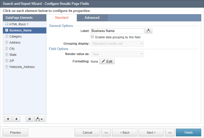
The next screen is for configuring results page fields. Select each field from the DataPage Elements list on the left and configure its properties on the right. You can insert new elements into the results page including HTML Blocks, Header & Footer, and Calculated fields using the Insert button .
Some field formatting options are driven by the style applied to the DataPage. More information about editing this aspect of your style can be found at Field Formatting Options.
In the Advanced tab, you can enable the Truncate option to limit the amount of text displayed from a long text field. Enabling Allow users to expand/collapse allows the user to see or re-hide the truncated text. The look and feel of expand/collapse is controlled in the Styles and for text links the language is managed in the Localization object of the DataPage.
If the Formulas and Calculations feature is available on your account plan, you can enable data grouping to group data by one or more fields and customize the Grouping display with the standard or collapsible option. See Data Grouping for further details. Grouping is only available on Tabular reports.
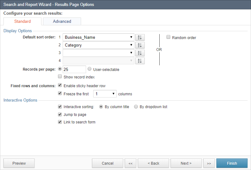
On the next screen you are provided with additional options to customize your search results page.
- Use the Display Options section to configure the default sort order of the results, number of records per page and displaying record index. You can also fix the header row and freeze columns on the report using the corresponding checkbox options.
- Use the Interactive Options section to enable interactive sorting, next/previous record navigation, downloadable search results, etc. (See Interactive Reporting Options for more information.)
In our example, we use Business_Name as the primary sort field and Category as the secondary sort field.
Configuring the Details Page
On the next screen you are given the option of enabling details pages (also known as drilldown pages). Details pages are ideal for records that have many fields that are not shown on the results page. When details pages are enabled, an option on each record in the results page allows the user to see all the details of that record in record details page. The details page can also be configured to have editable fields for updating records.
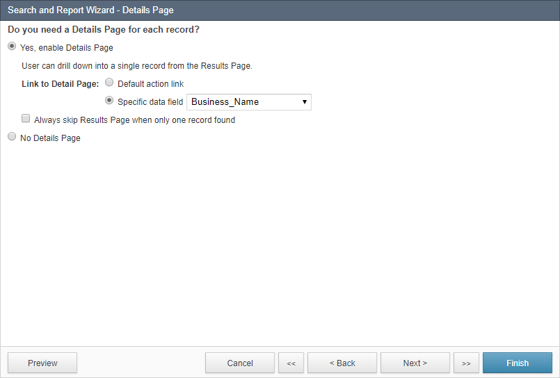
To enable details pages, check Yes, enable Details Page. Select Default action link for Caspio to provide an additional link on each record for going to details, or select Specific data field to turn one of the fields such as the Customer Name into a hyperlink that takes the user to the details page of that record.
In this example, we check Yes, enable Details Page and choose the Business_Name as our link to the details page.
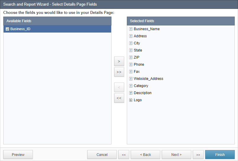
On the next screen select the fields that you want to use on the details page.
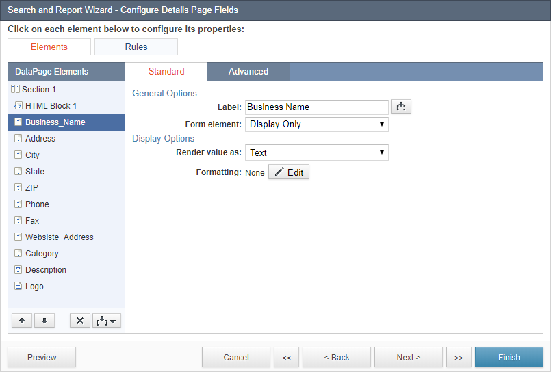
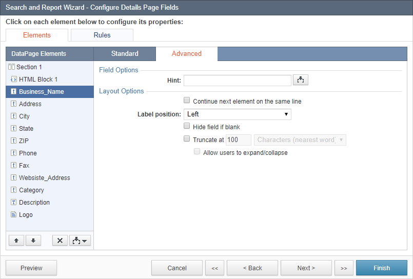
The next screen is for configuring the properties of each field on the details page. Select each field from the DataPage Elements list and use the right panel to customize the field’s display and other properties. By default all fields are set to Display Only. To make a field editable, change the field’s form element to an editable type, such as a text field, radio buttons, or a dropdown. Editable fields show the user the current field value but they can change it. When at least one field is made editable, the next screen provides you with the ability to enable automatic email and SMS notifications.
You can insert additional elements into your details page, such as a New Sections, HTML Blocks, Virtual Fields, Header & Footer, Calculated Field, and CAPTCHA using the Insert button . On the Standard and Advanced tabs, you can configure the various properties of the fields as you would with any Caspio forms.
Note that in multi-table views only one table may be designated as editable in the view. Fields from the non-editable tables of a view can only be set to “Display Only” in the DataPage.
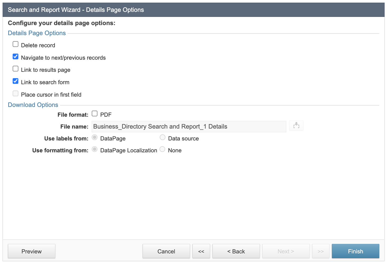
The next screen is the Details Page Options screen where you can choose to enable the following additional functionality in your details pages.
- Delete record – Allows users to delete records. This option is not recommended for publicly-accessible DataPages. Deleted records are permanently removed from your table.
- Navigate to next/previous records – Provides controls on the details page to go to the next or previous record based on the sort order. You can modify the style of the navigation in the Style object associated with the DataPage.
- Link to results page – Gives users a link or button (depending on the style) to return to the results page. You can customize the link or icon in Style and the text link in Localization.
- Link to search form – Gives users a link or button (depending on the style) to return to the search form. You can customize the link or icon in Style and the text link in Localization.
- Place cursor in first field – Places the cursor in the first editable field of the form when the DataPage loads. Note that if your first field is fairly low on the page, you may see an immediate scrolling when the page loads.
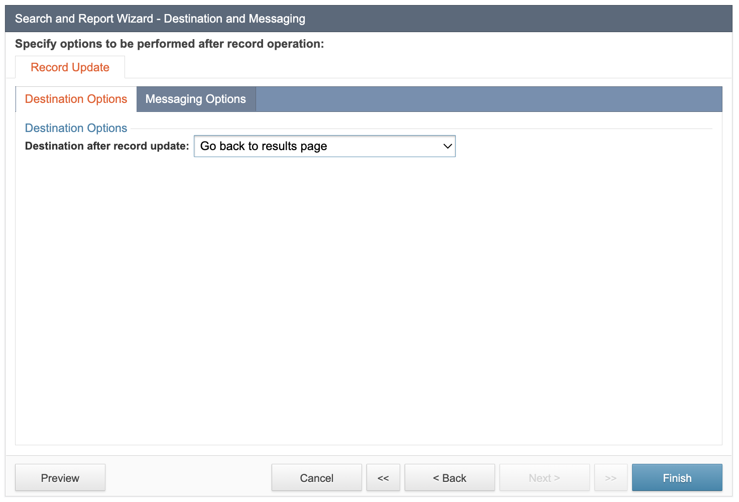
The next screen depends on whether any field is editable. If at least one field is editable, destination options become available and they dictate where the user is directed to when they click the Update button on the details page. In addition, automatic email and SMS options become available. There are acknowledgement emails that are sent to an email address from the record, and notification emails that are sent to one or more fixed emails such as people within your organization who need to be alerted about the change. Similarly, acknowledgement SMS messages are sent to a phone number from the form itself, and notification SMS messages are sent to fixed phone numbers. Learn more about email and SMS notifications.
After configuring emails, click Finish.
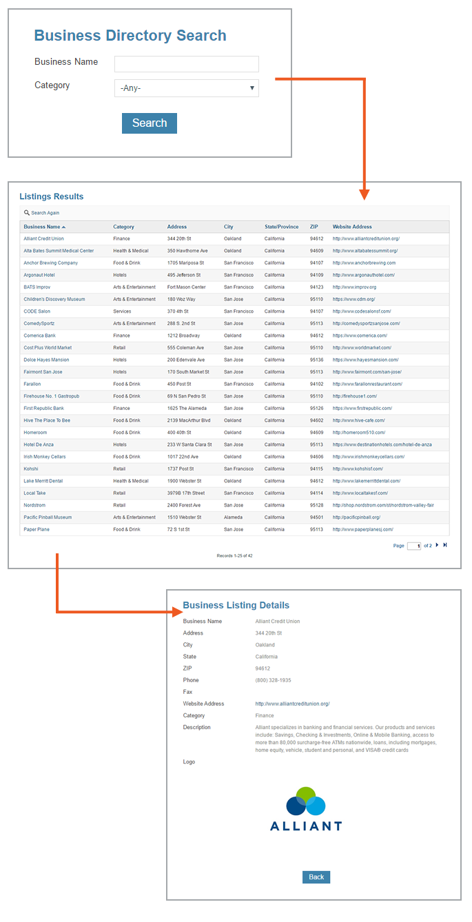
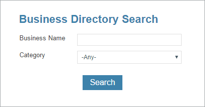
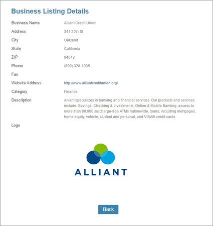
At this time your DataPage is created and you can click Preview on the DataPage listing page to view your report in a new window within your account. The search form should appear first, which can lead to the results page and the details page:
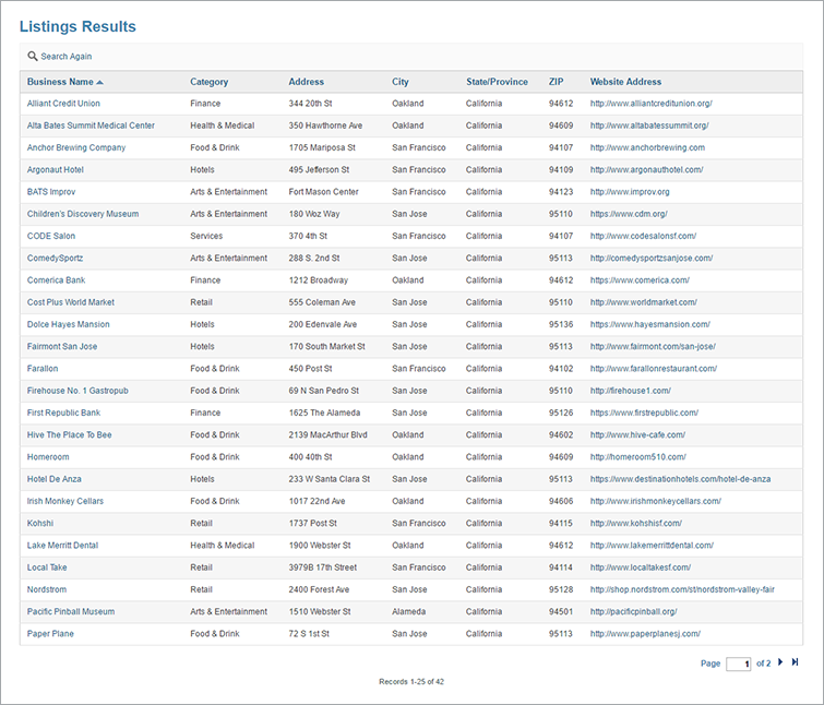
Once a business name is clicked, you are directed to the details page of the record.
To make any further edits to your DataPage, select the DataPage and click Edit to go through the wizard and make any necessary modifications.
Once satisfied with the results, you can deploy the DataPage on your own site. To deploy a DataPage, hover over the DataPage name in the DataPage listing page and click on Deploy and follow the instructions.